Article
8 methods of UX analysis

Use a Multidimensional Perspective to Inform Design Strategy
User-centered design focuses on satisfying the end needs of users.
Data – both quantitative and qualitative – informs decision-making for design direction. Understanding what the data is telling you impacts your information architecture, personas, user flows, interface design, and a variety of other aspects of the user experience.
Having multiple dimensions of data allows companies to innovate, and having a multidimensional strategy requires looking at a design challenge from different angles. Our 8 Methods of UX Analysis methods fall into four categories – the User Perspective, the Business Perspective, the Expert Perspective, and the Technical Perspective. Each offers a unique vantage point, allowing you to feed your design process with real insight.
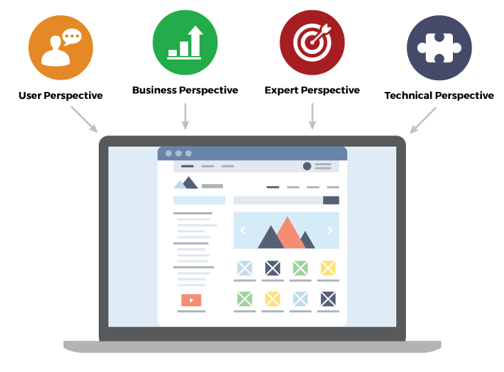
8 Methods of UX Analysis
1. Website and Device Analytics

It’s crucial to understand where your target demographic “lives.” What is their preferred digital environment? Technology changes constantly, and your users’ behaviors and preferences will change as well.
Device and Website Analytics reveal important information about click paths, target demographics, device preferences, and core browsers and technology.
Example: Analytics Provide Insight
Flurry Analytics is one tool we use to analyze user behavior in mobile devices. In the example below, we tracked how users progressed through a mobile application. When compared with a different version of the mobile app, we were able to see that the preferred version had only a 7% bounce rate, compared to a 23.5% bounce rate for the other version that showed a full-screen advertisement.

2. Business and Sales Analytics

Understanding business and sales data is an important part of UX as well. What strategic moves are yielding the most value? Which can be reconsidered?
Business and sales analytics allow companies to measure their success and evaluate how to improve concretely.
Example: Sales Data Reveals Key Demographics
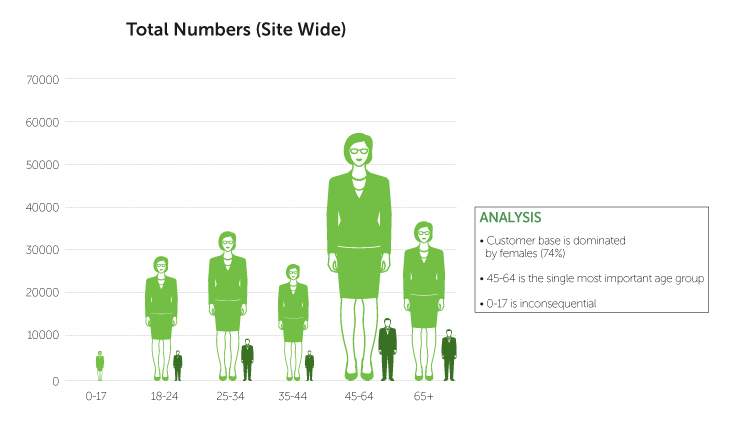
Business and sales data reveals important information about your product and users. Even though web statistics showed a more balanced demographic, one client’s sales data revealed that they had a predominantly older female user base actually purchasing. This data, illustrated below, was important to consider when it came to brand redesign.
3. Competitor Benchmarking

Competitor Benchmarking will surface opportunities for improvement or differentiation. It also indicates areas of strength.
By exploring qualitative data (observations, discussion of trends, etc.) and quantitative data (concrete numbers and statistics supporting the qualitative assessment) the team can make recommendations to meet – and ideally surpass –the moves being made by the competition.
Example: Analyzing Usability
The Competitor Benchmark below analyzed the number of “steps to checkout” of similar e-commerce sites.
After conducting benchmark analysis, we analyzed how to keep the steps simpler and shorter to reduce dropout.

4. UX Principles Benchmarking

Timeless principles exist for a reason – in many cases, they’ve been proven to enhance products.
UX Principles Benchmarking evaluates the website or product against principles – and myths – and uses them as a metric to identify how to improve the design. Principles and myths are indicative of what works and what doesn’t. They act as a litmus test for what constitutes sound design.
Example: Benchmarking Against Specific Principles
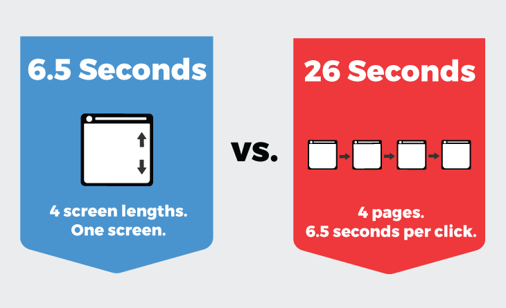
An example principle is that “scrolling is faster than paging.” Each time a user clicks to a new page (called “paging”), there’s an average 6.5 second refresh time. A user can scroll one long page (made up of multiple page sections) in a matter of seconds, versus spending a ton of valuable time transitioning between pages (e.g. spending 26 seconds viewing 4 pages).
Using this principle as a benchmark, we’d provide recommendations for how a client could make their website more scrollable and scannable.
5. UX Checklists and Heuristics

At Fresh, we use both a 150-point checklist across 10 categories and multiple heuristic frameworks used to analyze whether or not websites are high-end. These expert reviews serve to evaluate, concretely, how to improve a design.
Examples of key elements analyzed include whether content is current, whether included advertisements are professional and relevant, and whether branding is consistent throughout the site.
Example: A Framework for High-End Websites
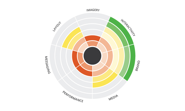
Below is our 7 Ingredients for High-End Experiences heuristic framework. It’s one of our tools for inspecting and summarizing different aspects of a website’s performance.
6. UX Trends Evaluation

A UX Trends Evaluation identifies new directions in the field of UX and assesses whether or not your product could benefit from more cutting-edge design work.
Innovation is exciting. However, in user-centered design, it’s important to focus first and foremost on the end needs of the people using your product. While UX is expanding in new, innovative directions, analysis should also prioritize your target users and their needs, matching them with trends that fit.
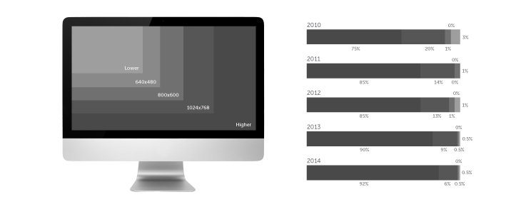
Example: Large Screen Sizes and Higher Resolutions are Trending
In addition to mobile screen sizes, people are using larger screens with higher levels of resolution to access websites. Without designing with these habits in mind, your experience might look and feel low-end. The fact that screens are becoming increasingly larger, with higher resolutions, is important to analyze and account for.
7. Technical Analysis

Which integrations are easy to make? What constraints and limitations need to be accounted for? Maximizing design efficiency comes from understanding the consequences of design decisions as you understand and leverage the technology.
Tech Stack Constraints – Which aspects of your tech stack will make your site most efficient?
Performance Constraints – Will the design slow down performance?
Integration Constraints – What systems can your website be integrated with to increase performance?
Back-end CMS/Admin Constraints – What is the right content management systems to make maintenance of your site easiest?
Example: Choosing the Right Tech Stack
We built Washington Federal’s website on the Microsoft stack after understanding their technical requirements. By understanding the CMS system constraints, we were still able to build a highly customized design and leverage the right CMS plugins to help development move faster.

8. Process Analysis

Analyzing the process a user goes through in using a system allows you to paint a picture of the challenge before designing a solution.
Understand the Challenge and Design with Empathy – Improving a process or system requires understanding how it works for users.
Think Through Flow and Focus – The core of a web or mobile application is its user flow. Asking stakeholders and users if it makes sense aligns the experience to their needs.
See the Big Picture – Thinking at a high level takes you out of the granular details of a design (e.g. the layout of data entry fields) and helps you think broadly about what users are trying to do and how you can help them accomplish their goal.
Consolidate, Separate, or Reduce Processes – Documenting processes and steps a user goes through allows you to identify which steps should be consolidated and which should be broken apart. A system that consolidates the information automatically will be more user friendly.
Download our UI/UX Design Process Infographic!
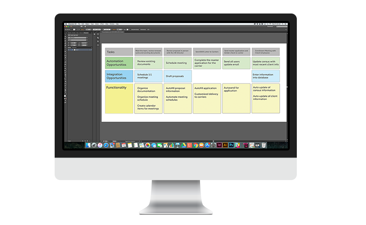
Example: Process Analysis in the Healthcare Domain
One of our clients in the healthcare industry approached us about building a CRM tool to manage their benefits administration. Process Analysis enabled us to answer how to create a minimum viable product that made their core processes more efficient.
Conclusion
Data – both quantitative and qualitative – tells a story about what is working for users, stakeholders, and businesses.
Ultimately, analysis adds clarity and serves as a justification to make important decisions with confidence. As opposed to making design decisions that don’t have evidence or justification could come across haphazard, UX Analysis provides the multidimensional perspective to take your design strategy from acceptable to exceptional.
Because data drives insights that drive strategy that results in more meaningful user and customer experiences, there is value and ROI in including analysis in your design process.


