Article
8 Methods of UX Testing

We consider UX testing integral to creating world-class products that users love. It has the ability to reduce the long-term cost of a project, while delivering superior performance to end users. For these reasons, it yields an enormous value.
There are three reasons why we recommend testing:
- To reduce risk. Reducing risk of failure normally increases the chances your product will succeed.
- To reduce cost. Investing in testing with users ensures that issues get caught sooner, good ideas are introduced faster, and unnecessary product design and development efforts are reduced.
- To make the product better. Creating user-centric, award-winning UX typically involves testing.
At Fresh, we conduct UX testing where it makes economic sense to do so. Our goal is pragmatism. Varying levels of testing accompany varying levels of expected ROI (Return on Investment). For larger projects, often with a bigger budget, more testing might make sense – we’d recommend more testing for a 100M e-commerce business than we would for a 1M service business with a marketing website.
Learn about the 8 Methods of UX Analysis here!
Fresh’s 8 Methods of UX Testing
We recommend that UX testing should be integrated and understood as a part of the scientific design process. Integrating testing leads to meaningful insights and feedback. These findings inform and validate design decisions that have serious and long-lasting implications.
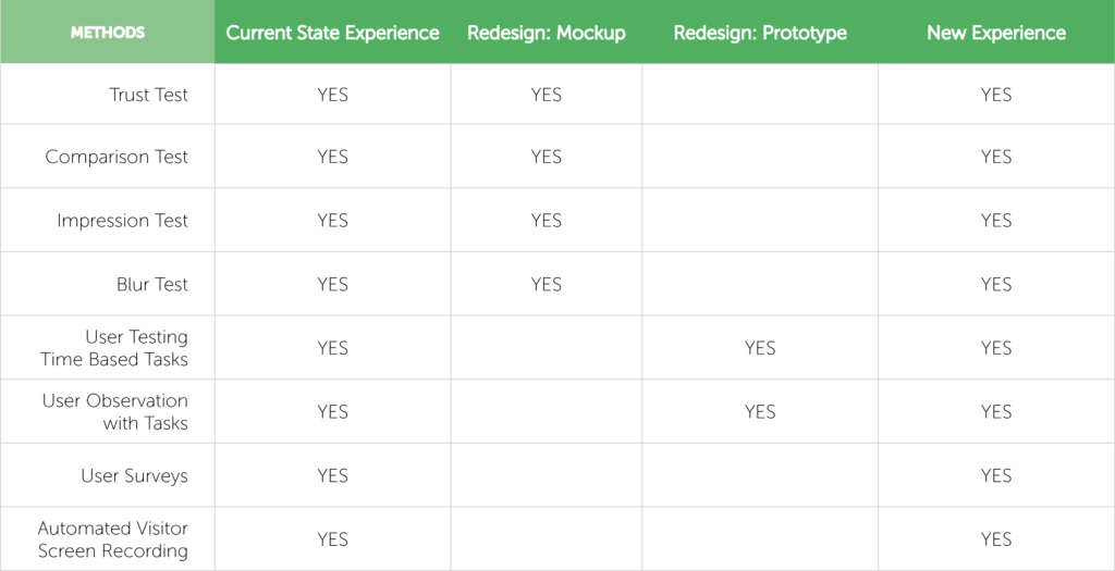
At Fresh, we utilize 8 Methods of UX Testing as a part of our design process. Depending on the context of the project or the nature of the problem being solved, certain types of testing are recommended.
1. Trust Test
Basic 5-second trust test to measure confidence and credibility
Trust Tests focus on identifying messaging and credibility issues. They’re valuable because they reveal the initial reactions users have to a particular website or product. Would users actually use the site or buy a product? What degree of confidence would they have in using it?
Results are analyzed along with data gathered during user interviews, expert reviews, and web analytics. The test is used to further explore or validate a hypothesis.
2. Impression Test
Basic 5-second impression test to measure gut reactions, including a keyword summary
Impression Tests also focus on identifying messaging and credibility issues. Though similar to a Trust Test, Impression Tests involve more open first impressions with a commentary and a keyword summary that can highlight key reactions users are having. Designers come away with specific words and phrases users use to describe their gut reactions.
Results are analyzed along with data gathered during user interviews, expert reviews, and analytics. This test is used to further validate or invalidate whether design and messaging are working together.
3. Comparison/Preference Tests
Comparison/Preference tests of 2 or more alternatives with statistical results
Comparison/Preference Tests are conducted to evaluate two or more alternatives, such as two design comps or your design versus a competitor’s. These quick A/B tests at the design stage can quickly indicate which options work best, helping designers make decisions quickly and with confidence.
User data is captured via online surveys with users in the target demographic OR in-person, with an observation of the user analyzing the two designs.
Comparison Tests are conducted after a hypothesis has been formed. Results are analyzed along with data gathered during user interviews, expert reviews, and analytics. The test is used to validate or invalidate the hypothesis.
4. Blur Test
Blurring images to evaluate what is appropriately or inappropriately calling attention on the page
Blur Tests are used to analyze whether or not users are able to identify important images and Calls to Action (CTAs).
The test is subtle and makes it easy to decipher if we are using color and layout appropriately to call attention to what’s most important. Is the layout and hierarchy attracting users’ attention to the most important areas of the site?
The blurred images are created using Photoshop, or another graphic design tool, to layer over an existing screenshot. Copy, images, and other important site features are visually obscured while colors remain. The test is conducted to see if, when obscured, the CTAs or design elements are striking enough to draw a user’s attention.
5. Time Based User Tasks
Preparing user tasks for key pages and user stories, observing whether users are successful and measure the time required to complete each task
Time Based Tasks are used to investigate the flow of the design. We seek to test the design, correcting layout and workflow issues to minimize the amount of time and thought that go into completing a task.
The format is simple: users are given specific tasks to complete when using the site. Researchers identify whether users are able to complete these tasks successfully and in how much time. The time and efficiency directly relate to usability.
The data gathered is used to clearly understand what’s working efficiently and what’s not.
6. User Observation with Tasks
Preparing user tasks for key pages and observation of users, often in the target demographic, often with video capture for post-analysis
User Observation allows us to capture the user’s experience in completing different tasks. This is directly related to time-based tasks, and adds an extra layer of understanding for designers.
Video recordings, with users talking through the process, allow the team to capture both the screen interactions and the emotional response.
The data gathered is used to evaluate large and small pain points and opportunities for improvement.
7. User Surveys
Various questions to identify pain points, get suggestions for opportunities, rank features, and more
User Surveys are issued to gather quantitative and qualitative data about users and their reactions to a design or concept. Well-written surveys offer the opportunity to quickly and easily gather feedback from a larger sample of users.
Using survey software such as Google Forms and Survey Monkey, we gather user responses to identify actionable areas for improvement. Due to the way that surveys are constructed and distributed, this process allows us to tap into a variety of issues.
8. Automated Visitor Screen Recording
See the user’s experience via screen recording, analyzing interactions and pain points
Automated Visitor Screen Recording is used to visualize the user’s experience through a screen recording, viewing complex interactions and product pain points. The method goes beyond analyzing what users are doing, and gives some insight into why and how they are doing it.
Software solutions (like Jaco) do require adding a small embed code to your site to start recording user interactions and UX pain points.
The accumulated data helps uncover flow issues, reveal click behavior, and inform the design process overall.
When to Test
There is an optimal point for testing a feature of a product. Testing should be conducted at the right moments throughout the design process.
We test as soon as it’s necessary. Issues identified later are more expensive to resolve.
“When” you should test connects to “why” you should test. Testing should take place because it makes economic sense to do so. To get the greatest return from results, testing early is strategic to re-design work. Later testing can validate design improvements.

Conclusion
Conducting no user testing is a risky proposition. The reality of UX is that it is a fuzzy process of well-educated trial and error. We test because testing decreases the probability of failure. It also decreases the scale and impact of failure.
Although the testing process is extensive, it can be modified depending on the project. Testing goes a long way towards determining the success of a design. We recommend developing a concrete process that allows you to test consistently with one or more methods. By challenging your assumptions, designing for the end user, and following a formal process, you can reduce the costs associated with testing and get the ultimate return on value.
To reiterate, user testing is integral to delivering a world-class product. Yes, it’s important to be pragmatic and economical when it comes to testing, but we consider it an essential cost of creating a high-quality user experience.
Testing should also be integrated. As shown in the previous table, testing doesn’t strictly fall at the beginning, middle, or end of the design cycle. Rather, it should be a key component of design throughout the entirety of the process. Test to reduce risk, reduce cost, and make your product better. We recommend these 8 Methods of UX Testing as a strong place to start.


