Article
Discussing UX Design: Assembling Visual Elements
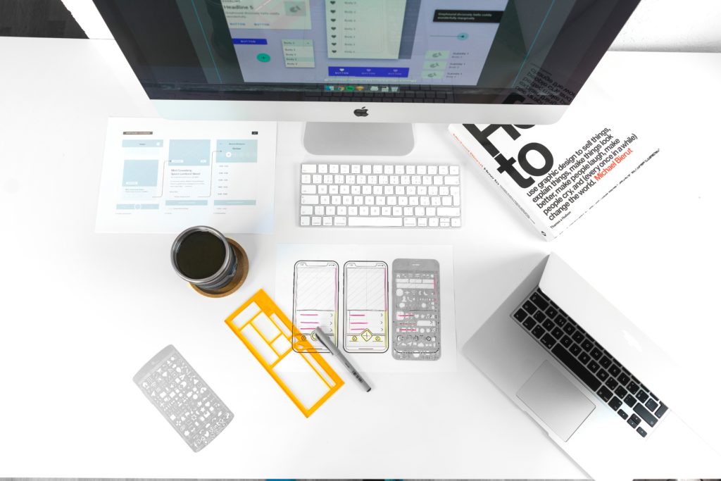
The visuals in your UX design should tell a clear and compelling story.
Understanding your users and their needs allows you to conceptualize the visual design of your product. Being diligent about how you assemble elements like color, text, and images is key in generating positive responses and emotions from your users.
Design Visualization
- Clickable Prototype: Another rapid prototyping option. Online programs like InVision allow designers to quickly put together a set of screens with hotspots that can be clicked, taking the user to another screen. It is a better way to simulate what an actual, coded website would look like, although it takes more time to set up than a paper prototype. Don’t Build It, Fake It First: Prototyping for Mobile Apps
- Customer Journey Map: A diagram that shows the cradle-to-grave journey a customer takes when interacting with a company. It starts with the initial contact and continues through the decision-making and buying phases, and then through to upgrading or replacing the product. It can be used to evaluate how effective the common touchpoints are with a customer. Using Customer Journey Maps to Improve Customer Experience
- Low/High Fidelity Wireframes: Varying degrees of detail in wireframes. Low fidelity wireframes are missing many elements (colors, material design, etc) that will be in the final product, but they allow for quicker communication with other designers or stakeholders. High fidelity wireframes aim to be as close to the final product as possible. They are appropriate when nearing the final stages of design, where clarity and consensus on design details are needed. What Is the Difference Between Low-Fidelity and High-Fidelity Wireframes?
- Mockups: A design tool for pinning down the final graphical elements of an interface. Rather than focusing on functionality, a mockup describes the look and feel of the interface. What Is a Mockup?
- Mood Boards: A display of visual assets (such as fonts, colors, or images) that capture the emotional response a brand or site should elicit. In the early stages of branding or design, the mood board can help set the tone for any design choices that are made during the mockup and prototyping stages. Mood Boards in UX Design: Ignite Passion in Your Users
- Paper Prototype: A version of a rapid prototype, where screens are drawn on paper. The researcher then manually switches to a different “screen” if the user “clicks” on an interaction. Paper prototypes are a good way to do early prototyping without investing in a lot of development on a design that may be changed completely. More from Wikipedia
Design Attributes
- Accessibility: A measure of how accessible a website is to users with functional impairments. For example, additional features can be implemented to help visually impaired site visitors, such as image meta tags, voice assistants, or text readers. For hearing-impaired visitors, captions or transcriptions of video and audio content are useful. Introduction to Web Accessibility
- Affordance: Any action an object can accommodate. For instance, a “button” on a website can be “clicked”. 6 Types of Digital Affordance that Impact Your UX
- Chunking: A technique of breaking information into smaller pieces in order to help users assimilate it. One example is breaking text into multiple paragraphs, sections, or boxes so that users can process it one piece at a time. How Chunking Affects Content Processing
- Color Psychology: The psychological study of how colors influence emotions and cognitions. For instance, color can affect brand recognition, gendered product appeal, perceptions of trust, and emotional reactions to a product. Color, Psychology, and Design
- Conversational UI: Any element of a user interface that mimics a human-to-human conversation. Voice assistants and chatbots are two clear examples, but elements of conversation can appear in the copy as well, such as when an “OK, got it.” message is displayed after a user clicks a button. These interface features make the UI appear more responsive and less impersonal. The Conversational UI and Why It Matters
- Discoverability: The degree to which users can discover useful information on a given website. While findability deals with the presence of useful and expected information, discoverability deals with whether the user can easily locate that information. Findability vs Discoverability
Design Elements
- Above/Below the Fold: Content above the fold is content that can be seen when the page is loaded. The content below the fold is content that users must scroll to see, and this area should include more supplemental content. More from Wikipedia
- Copy: The strategic writing on the website that includes messaging, calls to action, buttons, and other snippets of text. The quality of copy affects how clear and compelling the user’s next action is. Also related to copy is Typography – the design of the printed language. UX designers are concerned with the way typography affects information processing and emotion. Copywriting for UX & More on Typography
- CTA (Call To Action): A message that prompts the user to take an important action. It could be to “Call us for more information” or “Buy Now.” More from Wikipedia
- Grid: A division of the interface into equally-sized columns and rows. It helps with appropriate placement of page elements, control of white space, and alignment of content on the screen. Many websites are developed with a grid. It’s also key to responsive design, where page elements can snap to a smaller or larger grid when the page is resized. The Anatomy of a Grid
- Kerning: The process of adjusting the space between two letters in a font. In every font, the width of letters and the amount that they hang into space to the left or right of their stem can change. Kerning makes the design more balanced and the text easier to read. More from Wikipedia
- Leading: Often referred to as line spacing, leading is the distance between the baseline of one line of text and the top of the next line of text. More from Wikipedia
Design Style
- Adaptive Design: Adaptive design is similar to responsive design, except that the layout stays fixed until the screen reaches a specific size, and then the layout “snaps” to a new format. Adaptive design layouts only change a few times, while a responsive design continually changes its layout to mimic the screen size. Adaptive vs Responsive Design
- Flat Design: A trend in web design where the appearance of buttons, icons, and other design elements is flattened to create a minimalistic design. Once most people were familiar with the functionality of a button or text box, designers started to simplify these symbols to give the website a cleaner interface. More from Wikipedia
- Fluid Design: A fluid design is created by setting width percentages for each element of the page so that they change size as the window is resized. Although it works for many screen sizes, it tends to look awkward when the screen is significantly larger or smaller than the designer’s screen. See How Different Responsive Layouts Work
- Material Design: A design style advocated by Google. It strikes an aesthetic balance between flat and skeuomorphic design. What Are the Real Merits of Material Design?
- Motion Design: A part of interaction design that deals with motions that happen when a page element is interacted with. Examples include drag and drop functionalities, motion graphics used to introduce modal windows, and quick animations. UX in Motion Manifesto
- Responsive Design: Design that considers screens of all sizes. Since users may be accessing a site from a mobile phone, tablet, or laptop, not all screen elements can be easily used across these varying screen sizes. More from Wikipedia
Recommended UX Tools
- Axure: A prototyping tool that allows for advanced prototype functionality without custom code, such as math functions, animations, and conditional statements. Axure
- Balsamiq: An affordable wireframing tool that allows for both sketch-like drawings and clean wireframes.
- Sketch: An editing tool that makes it simple to create wireframes and prototype screens.
- InVision: An online tool that allows you to upload prototype screens and add hotspots that connect to other screens in the prototype. It is a simple way to create a clickable prototype.
- Principle: A prototyping tool that excels at creating smooth animations and interactions.
- Framer: A dual design and code tool. It runs on code-based design so that a prototype can be coded and quickly designed for team and user feedback.


