Article
Autocomplete suggestions: varieties, benefits & UX best practices

For just about everything besides scenic drives, people prefer shortcuts. And if a shortcut not only gets you there quicker but also takes you to a better destination, now that’s something!
This is what autocomplete does. By giving users the option of completing words and forms based on what they’ve typed before, it shortcuts their search and input tasks. Autocomplete makes it easy to express an informational need and find helpful results.
Whether we’re searching the web, adding a contact to an email, or texting a friend, autocomplete is our helping hand, interpreting our intentions, completing our thoughts and providing suggestions that help us find what we’re looking for faster.
Fresh designers took a deep dive into the user experience of autocomplete. We reviewed the relevant research and common usage patterns, designed a few iterations, and came away with three varieties, four benefits and six best practices we’d like to share with you.
Three Autocomplete Varieties
1. Basic Autocomplete
At its most basic, an autocomplete is a search-as-you-type function that matches what a person types, usually the beginning of a word, or a prefix, with a word list.
You’ll find this simple form of autocomplete in applications that have a finite list of items such as a directory of contacts or locations.
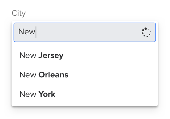
Autocomplete is helpful in mobile contexts where accurate typing on small, handheld keyboards is more difficult. And with smartphones and tablets making up 75% of all web traffic (CIODive, 2018), autocomplete is a convenience people now expect.
2. Autocomplete Suggestions
Autocomplete suggestions take things a (big) step further. Suggestions not only predict user intentions, but they also help users construct more useful searches than they might on their own.
Suggestions go beyond string matching by throwing new ideas into the mix. This is useful during information-seeking tasks where there isn’t a single “right answer.”

3. Instant Results
Sometimes users may prefer to autocomplete actual search results instead of reformulating their search phrase. What’s more helpful: a dropdown of search suggestions that lead to a search results page, or rich information right in the autocomplete?
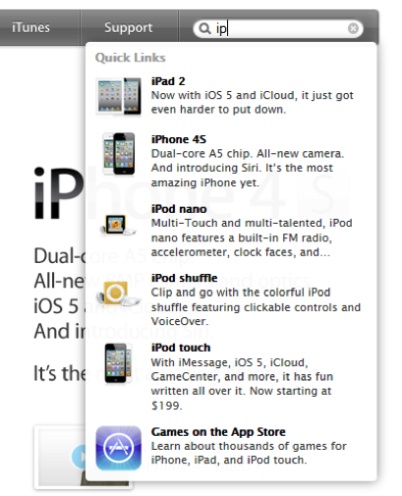
Instant results are most helpful for known-item searches. They are also useful when it is beneficial to see richer supplementary info (i.e., a thumbnail image) before making a selection.
Four Autocomplete Benefits
1. Save Time…Sorta
It surprised us to discover in user tests that autocomplete doesn’t always speed up the search process. While simple tasks such as writing an email seem faster with autocomplete, we found users read the suggestions before selecting, which adds time back into the search process. However, users perceive the search function as faster because it reduces their cognitive load. (Read more about perceived performance here.)

2. Avoid Typos
Autocomplete minimizes the number of characters a user has to type, thus reducing the potential for errors. In fact, we’ve heard from more than a few people around the office they use Google as a method of spell check!
3. Reduce Cognitive Demand
Don’t make your users think. One of the ten Usability Heuristics is recognition over recall: people are better at recognizing something than recalling it from memory.
Autocomplete reassures users they’re on the right track which often results in them adding query details as long as relevant suggestions keep appearing.
Even when users don’t select from the suggestions, autocomplete still provides a reference. It tells what’s available, how to spell difficult terms, and what other users are searching for.
4. Better Searches = Better Results
Like a human interpreter mediating between different language speakers, autocomplete improves the dialogue between humans and applications.
Users with less technological or domain-specific experience are poor at forming searches. If they don’t get good results at first, later search attempts are also unlikely to succeed. Some users will even give up.
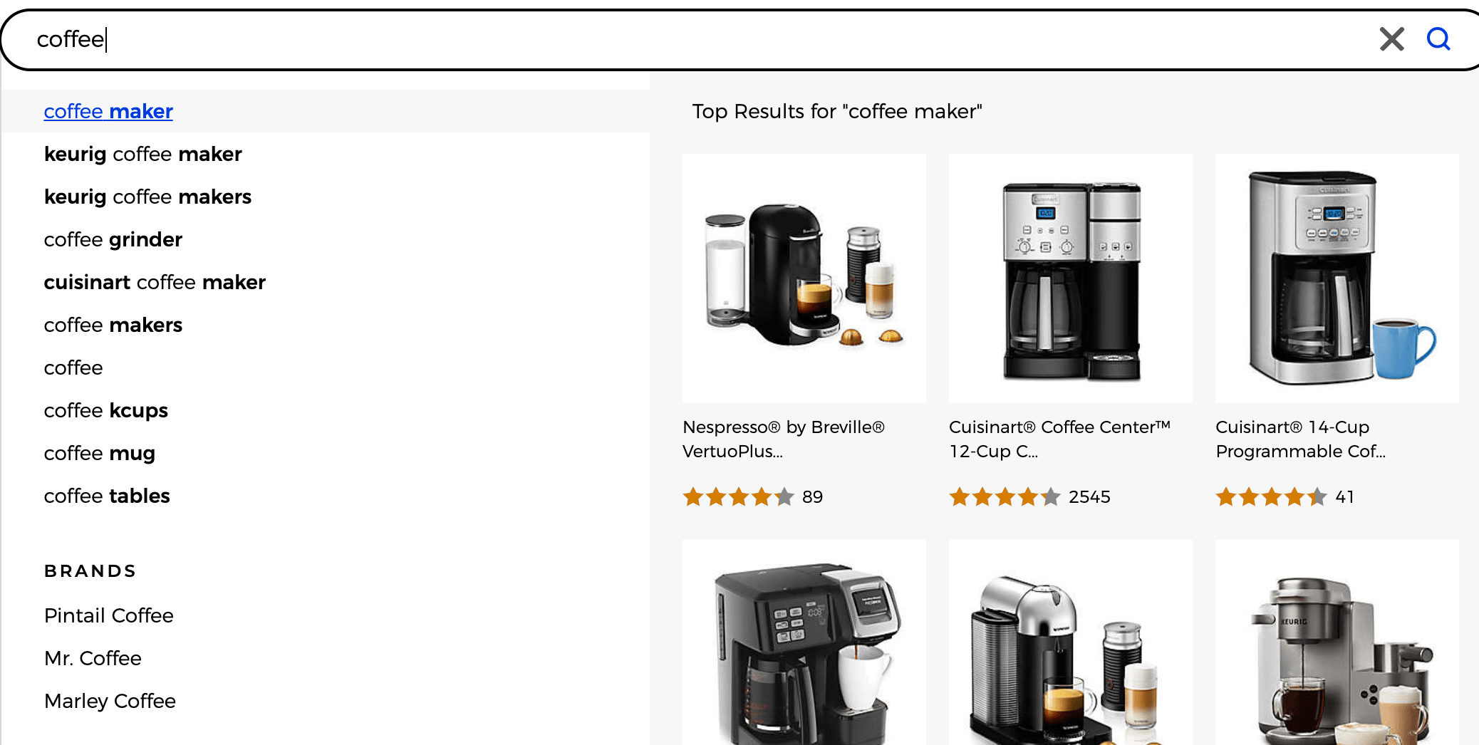
User tests have found that autocomplete suggestions alter how and what people search for. Users perceived the autocomplete suggestions as “recommendations,” and therefore showed a bias towards selecting them over using their own query.
More Controlled User Flows
Traditional “fuzzy” search where users hit a search button to see results creates a wider margin for user error that can lead to frustration.
Our designers recently assessed how a healthcare site’s users find information, and we found a marked difference if they used autocomplete. We provided participants with the fictional context they had an MRI and their doctor recommended a knee replacement. Without autocomplete, some test participants typed in terms like “knee surgery” and pressed enter.
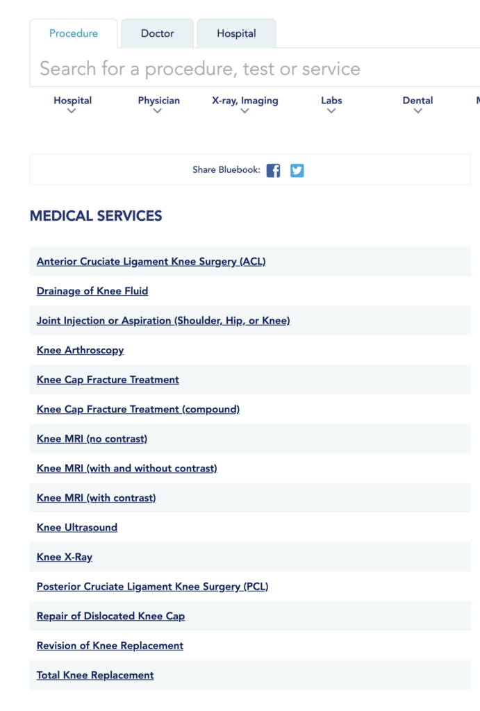
Those who used autocomplete got to the information they were looking for quicker.
Autocomplete saves typing, shows what is available, and gets searchers to the detail page quicker, bypassing the results page.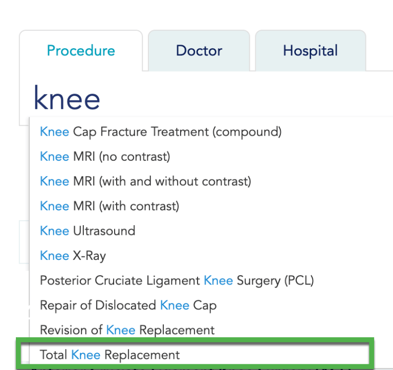
Tap-Ahead
“Tap-ahead” builds upon autocomplete suggestions by allowing users to append (add to the end) popular strings to the text they’ve already typed.
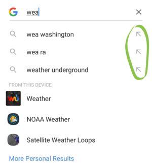
When a user arrows down the dropdown list or taps on the arrow icon to the right of the suggestion, that string replaces the initial query in the search box and allows them to continue typing. This is a great way to reduce the amount of typing while creating more precise searches.
Six Autocomplete UX Best Practices to Follow
1. Provide Predictions Quickly
Even though the technological landscape has completely transformed in the last thirty years, the essential advice regarding response times remains the same:
- 0.1 second – the user feels that the system is immediately reacting.
- 1.0 second – the user’s flow of thought stays uninterrupted, but they notice the delay.
Anything longer than a second delay and you run into issues with usability.
2. Support Keyboard Navigation
Supporting keyboard navigation is a core accessibility principle critical for users who unable to operate a mouse, such as those with a visual impairment, hand tremors, or repetitive strain injury (RSI).
- [up / down arrows] – navigate the autocomplete suggestion
- [return] – submit the focused suggestion.
- [tab] – accepts the selected suggestion and closes the dropdown.
- [esc] – closes the list.
3. Style Different Data...Differently
Style supporting information—such as category scopes or results type (i.e., “recent searches”)—differently from the suggested search terms. This makes it easier to scan because the user can distinguish the information at a glance.

Similarly, it’s often important to distinguish user-entered search terms from autocomplete suggestions. Since the user is already well aware of the term(s) they entered, it can make sense to highlight the autocomplete suggestions.
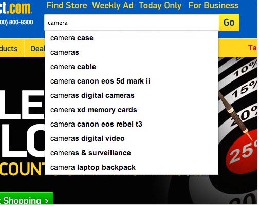
However, there are times to highlight the typed text instead of the suggestions, such as with long or multi-word matches. This is common with infix (intra-word) matching, shown below.
4. Choose the Right Matching Method
Showing users how their search terms are being matched by autocomplete helps them search more effectively and better trust the accuracy of the search process.
Prefix matching, where the beginning of the word is matched, is the most basic and common. But there are use cases where infix (intra-word) matching is a better solution, especially for search strings without common sentence spacing, such as email addresses.

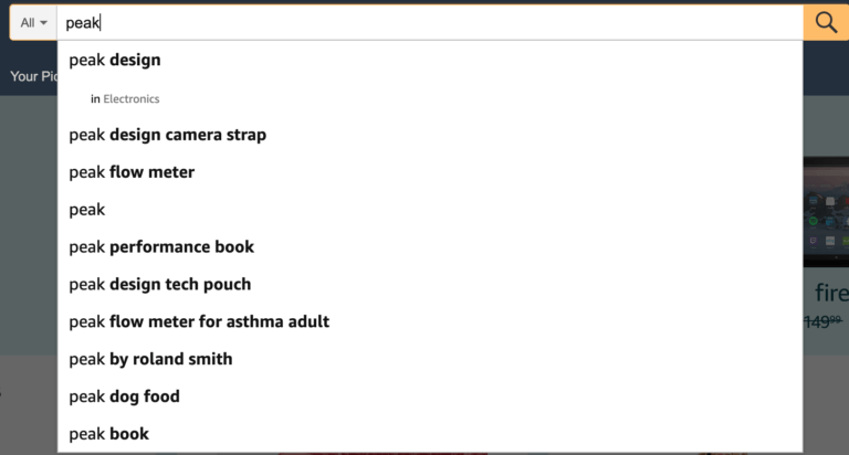
5. Keep the List Manageable
One of our core principles at Fresh is to strive for simplicity and clarity above all. This is because simple experiences encourage engagement, and this is especially true within a changing interface like a dropdown. Just like other parts of a site, keep the autocomplete list simple and manageable.
A good number of items to display is ten items or fewer.
Scrolling
If you must use a scrolling dropdown, keep it visible. Our recommendation is to avoid the trend to make it disappear when users are not interacting with it. We’ve observed that many people don’t notice that the list is scrollable and they miss items below the visible area. Scrolling errors increase on mobile devices because of the small screens and expanding keyboard that takes up a significant portion of the screen.
Spacing
Allow for adequate spacing in between each item for legibility and ease of touch, especially on mobile devices.
6. Sort Strategically
There are several ways to sort autocomplete suggestions: alphabetically, by relevance rank (most commonly used), by a specific region, or by other criteria or a combination. While sorting alphabetically produces more scannable results, sorting with other criteria decreases the volume of results the user has to review and (hopefully) delivers the most relevant results first.
Sort suggestions alphabetically when the differences in scores are insignificant, such as with names. Order by a score when there are significant differences between relevance scores, such as with a robust site search.
Wrap-Up
Autocomplete functionality is now an expected convenience. It helps users create better searches, get better results, reduce cognitive demand, avoid typos, and save time! Without autocomplete, a search feels like jumping into a murky abyss. In contrast, autocomplete feels like an elevator with clear signage to help users get where they want to go—informed and in control.
If you are working with a limited list of data, such as finding a contact in your organization, then consider using basic autocomplete to help users avoid typos, save time and make it easier to select what they want.
If users need help to find information in large datasets—such as in an enterprise search application—try incorporating autocomplete suggestions.


