Article
4 Steps to Good Halloween Maze UX

Designing a good maze requires challenging people, rather than frustrating them. And with Halloween mazes, there should be some level of fear involved with that challenge. So how do you create that optimal level of challenge and fear without frustrating people to the point of quitting …or worse yet, crying?
My advice? Pull from the UX design playbook.
Step 1: Sketch your ideas
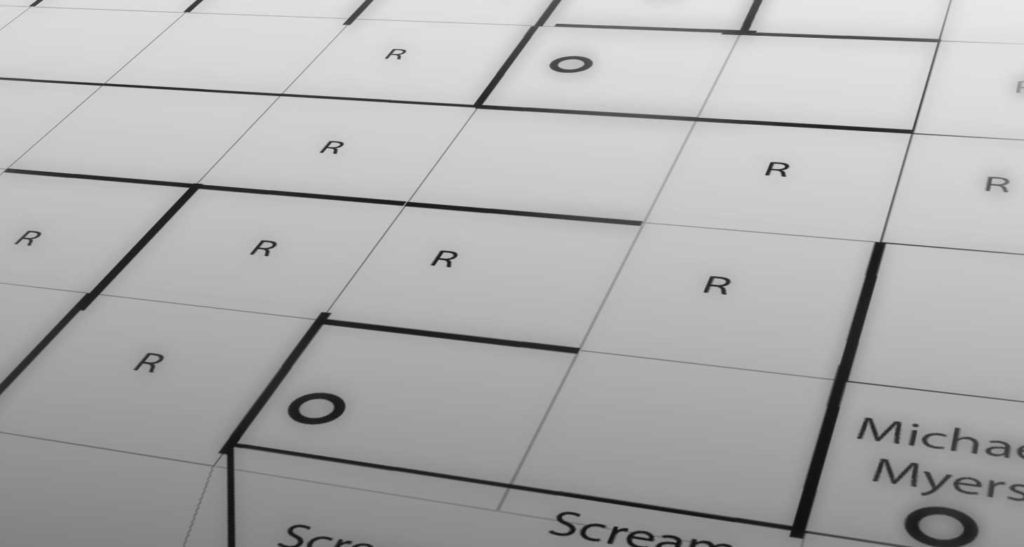
Start by sketching ideas and defining your maze parameters. How big of an area are you building the maze in? What is the minimum width and height your pathways can be? What materials will you need to set up the walls? Does the material require some variability? How can you build it to easily store and reuse year after year?
Step 2: Prototype and Test Before you Build
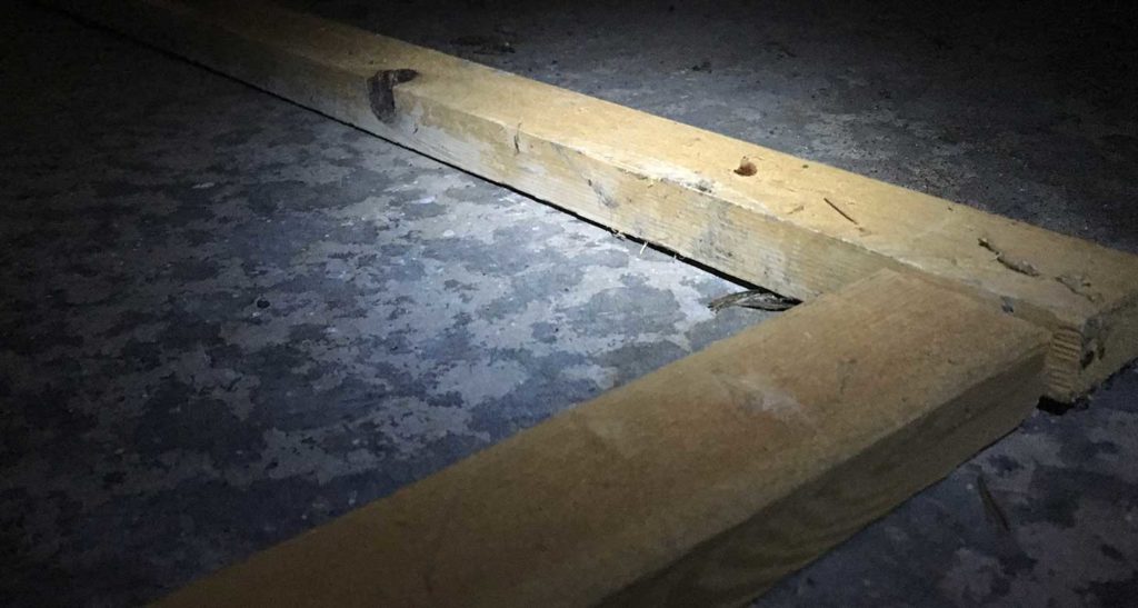
Once you have a design or two you think will work, layout the wall structure on the ground with markers that are easily moveable such as 1×2 boards, ropes, tape etc. Walk through the prototype walls and get a feel for how the paths and dead ends work to create the challenge. Have a family member walk through it with you and discuss intentions and options. You will get a quick idea of how difficult it will be or if you made it too easy. Once satisfied with the level of difficulty, build the walls.
Step 3: Add Misdirection, Guidance, and a Dash of Fear
The fun begins when you play with the user’s auditory, visual and tactile senses to guide, misdirect and instill a baseline level of fear. With usability design, the objective is guiding people to their end goal as quickly and easily as possible. With maze design, the objective is almost the exact opposite. Misdirection is what creates the challenge and encourages your audience to try to find the “right way” out. Below are some factors I add to my maze to create a balance of challenge and fear:
- Strobe lights (visual disorientation)
- Fog machines (limited visibility)
- Hanging gates (limited visibility)
- Monsters in dead ends (tactile and visual fear)
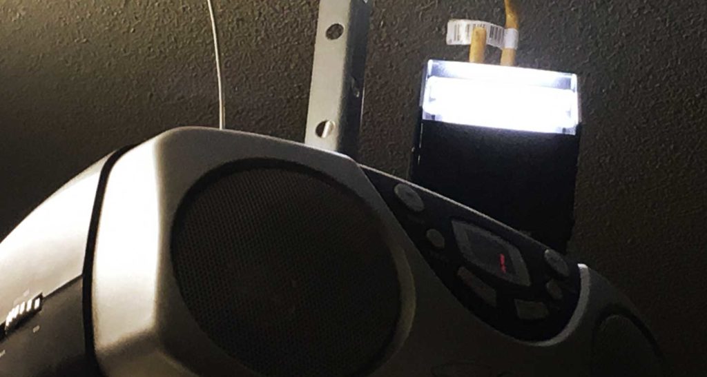
- Sound effects and scary music planted around the maze (repeated sounds from multiple spots make it hard to track your location)
Step 4: Beta Test Before Releasing the MVP
As with any product, you should test your creation on a sample audience before you open it up to full use. This will allow you to make adjustments before fully impacting a larger group of people. Some questions you will want to answer in your test runs:
- Is it structurally sound?
- Are the monsters lit well enough for people to see?
- Are the strobe lights flashing too fast or slow?
- Are the sound effects volumes balanced?
- Are the smoke timers set at good intervals?
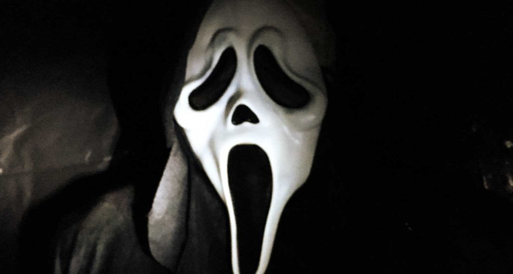
Once a few people have shown they are challenged and they didn’t have to call your cell for a rescue, you are ready to release to your full audience. Take notes on user feedback (often in the form of screams) and decide what to keep or change for future mazes. Happy Halloween!

