Article
UI/UX: Balancing Creativity with Convention
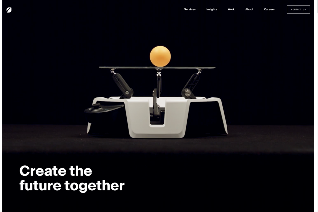
As digital designers, creativity is always a core value, especially at Fresh Consulting where we do design-led development. We’re constantly striving to create fresh, amazing experiences on websites, apps, and systems. That often involves incorporating something novel or creative.
At the same time, it’s critical to remember that a site or interface based on being edgy or super creative alone might be a unique experience, but could end up frustrating users, distracting from the site objective or leaving them confused about how to get the basic information they need. Suffice it to say, balancing convention and creativity matters in digital work. A lot.
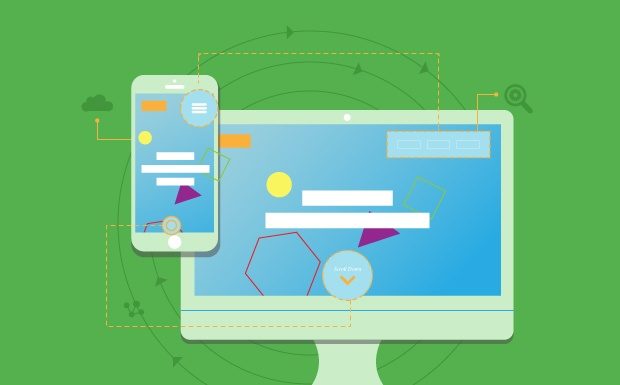
In our view, this necessary balance is tied into the heart of UI/UX work, where UI (user interface) is more closely associated with the work of navigation, layout, user flow, and information hierarchy, whereas UX is more closely associated with the work that builds on top of the UI as aesthetic graphic design, branding, messaging, and interactivity. There’s overlap in both, but UI/UX are essentially intertwined with the goal of making an experience both 1) efficient (interface part) and 2) engaging (experience part). That’s why we cannot ignore established conventions in the process of creating amazing experiences.
There is, of course, a point at which all design innovations are new (e.g. responsive design was coined in 2010)…and the best eventually become convention. But establishing a convention takes time; so design innovation must demonstrate a significant improvement with confidence over convention to ultimately become a paradigm shift. That may require some testing and rigor before you implement something based on a good feeling…because that feeling might just be your own.
In other words, be careful when creating new patterns for elements that exist as commonly known patterns elsewhere. For example, links should look like links, and buttons should look like buttons. Logins and shopping carts are typically located in the upper right, while logos and company names are often placed in the upper left. Search icons are magnifying glasses and hidden menus are represented by “hamburgers”, or three stacked bars; footers are historically at the bottom of the page; navigation is typically somewhere in the header area or sidebar area; people typically scroll vertically, etc.
Most interface’s navigation and base layout should already be familiar to users. You simply don’t want anyone to have to think too hard about where to find common elements because it can distract the brain from consuming the experience. Automobile manufacturers are constantly putting forth new car designs, but they have yet to reinvent many of the conventions. For example, moving a car’s turn signal control to the stereo display would be weighed carefully. It might feel cool to do something unconventional, but cool does not always equate to usability and efficiency, rather it can be quite frustrating.
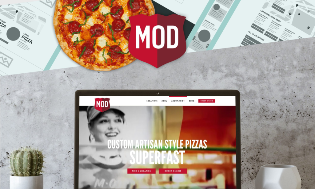
Basic elements like navigation, URLs, and button placement should focus first on usability before design aesthetic. This is why design best practice is to start with a wireframe that omits all design aesthetic (often UX) to make room for focusing on layout first (often UI). Once the ideal layout is established, there is plenty of opportunity to get creative where creativity will be appreciated. Just look at PatternTap and Dribbble to see how creative Creatives can get following standard conventions and patterns.
At Fresh Consulting, we want to win awards with our user experience, but we also want our websites, apps, and systems to work well for users. Hence, the importance of balancing creativity with convention as we focus on the art of good UI/UX.

