Article
UI/UX Principle #36: Prioritize What to Include, and When, with Help from Your Audience

Prioritizing features with customers is important because it leads to simplification.
Designers often stuff the first iteration of a product with so many features that it overwhelms users and obscures the product’s value. Without agreeing on the most essential features for a product’s initial release, you risk creating an unlovable product.
We argue that prioritization of features allows you to hone in on a Minimum Lovable Product, or MLP in our white paper, The Strategy of Starting with Less. But the practice of prioritization applies to all aspects of interface design and extends beyond the features you include.
Prioritization helps the client, users, stakeholders, and design team:
- Decide what to put in the navigation
- Understand what is core to the user base
- Tailor the marketing messaging
- Decide where to focus more in design and development
- Decide what to highlight and what to hide
How do you get there? There are a variety of approaches. We’ve found three approaches to be particularly helpful: story mapping, “buying features,” and affinity diagramming.
Understand User Behavior through Story Mapping
A story map helps the design team identify user needs and conclude whether or not the design is meeting them. It also helps the team prioritize features based on the hierarchical importance of needs.
We created the following story map during a project for an online book retailer:
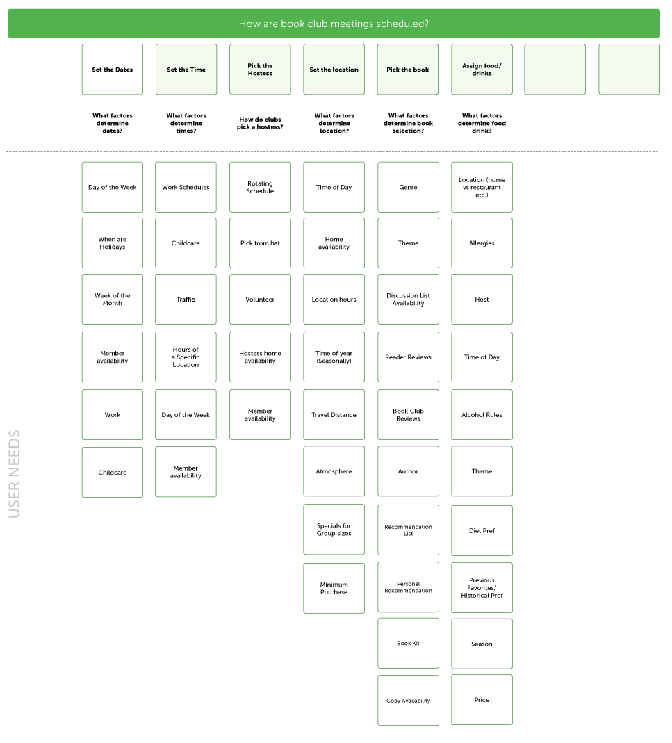
The story map was used to clarify and prioritize the needs of users who were scheduling book club meetings. We wanted an app that accurately represented those interests and helped accomplish that objective.
You might have 30+ features in mind, but users might only need 2-3 core features in order to accomplish what they need to. Are users using the app for a specific purpose every day? Which users? When? Why? Story mapping can help you answer those questions.
Understand Stakeholder/Customer Priorities with “Buy a Feature”
The business reality is that additional features and functionality often have a high price tag. This is another important piece to consider when working with stakeholders.
Stakeholders might propose 100 pages in a sitemap, but it might only be necessary to include the 4 most essential pages in the website’s first iteration. They might identify 20 application features that are “must-haves,” when in reality, a leaner application might be more feasible and more tuned in to what users actually need.
In order to identify what is essential to stakeholders, a simple exercise is “Buy a Feature.” One approach is giving 100 “dollars” to each stakeholder, with instructions to pay for each feature based on how important it is. Each feature has a cost to develop based on the effort required. As stakeholders allocate what they want to buy with their limited resource, the team can begin to develop a prioritized feature list. This can also be done with customers.
This exercise can be used to synthesize the different features stakeholders or customers really care about. Forcing tradeoffs with limited resources helps reveal what is most important. Sometimes it’s a single feature that everyone cares most about, and understanding that sentiment changes the product focus.
Whether you do a buying exercise or ask users to rank features – similar to conjoint analysis – the core objective of the exercise is to force trade-offs and get at the meat of what users care about most. With that information, you can develop a solution where core needs and wants are included because they’re the main tasks to be facilitated.

Understand and Organize Priorities via Affinity Diagramming
Affinity diagramming is a great exercise for high-level organization. We recommend using affinity diagramming to:
- Brainstorm (with stakeholders, product teams, or users) what to build/prioritize
- Group similar items together according to the “affinity” (a similarity of characteristics suggesting a relationship)
- Create a platform for voting, where each member of the team ranks and prioritizes the groups
In UI/UX Principle #16: Use Affinity Diagrams to Collaboratively Clarify Fuzzy Data, we outline the following approach:
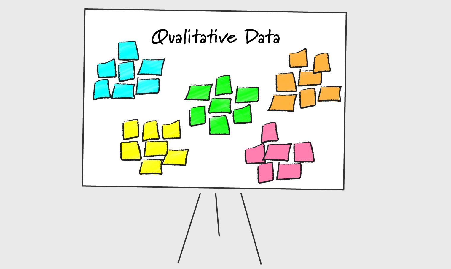
- The team commits all of the ideas to Post-It notes, of which there can be dozens
- The team posts all of the transcribed ideas to a large whiteboard, which enables the Post-Its to be manipulated
- The team, in a pre-designated “timebox” – 20 minutes, for example – organizes the ideas thematically
The team continues to organize (and reorganize as needed, if there’s any disagreement) the individual points into meaningful categories until the end of the timebox when, ideally, all designers come to a consensus on the most important recurring themes in the affinity diagram. Voting can also be used at the end of this exercise (e.g. sticker dots placed on sticky notes) to indicate what options are most unanimously popular. In the process, it’s easier to see outliers that don’t fit into groupings or don’t get votes. The data reveals that they don’t require the same degree of prioritization.
In a recent project, we used affinity diagramming to bring together stakeholders from a variety of departments at a major research institution. In order to create a website that satisfied the needs of each department, there needed to be consensus about which features to prioritize. Affinity diagramming helped achieve that consensus.
Conclusion
These methods are several that we use, but there are a variety of others. If you want to dive deeper into other resources, consider the Kano Model, which explores the degree to which customers are delighted by a product versus the degree to which a product is functional.
Regardless of which method you use, the objective of prioritizing your feature set with customers is to simplify your designs. In a post on striving for simplicity and clarity above all, we argued that simplicity is actually “layered complexity.” Your product will still be sophisticated with a smaller number of features, but it will benefit from being lovable. 🙂
Ideally, in prioritizing features, you’ll develop a roadmap to creating something lean and simple that optimizes for speed, accounts for functionality, and incorporates design elements that enhance the overall experience. Products like these are more likely to capture people’s attention and put you above the competition.

