Article
UI/UX Principle #40: Create Two Way Communication, with Frequent Feedback to Confirm Actions Taken

Back in 1995, Jakob Nielsen wrote his 10 Usability Heuristics for User Interface Design. The first one on his list is:
Visibility of System Status: The system should always keep users informed about what is going on, through appropriate feedback within reasonable time.
20 years later, this principle is not only relevant, but it has become even more important as dynamic experiences have become more interactive. When users are interacting on a website, within an app, or on an application, they need to have an awareness of what’s happening as your product processes interactions. What if a website application was processing your information through 3 algorithms, pulling additional data from 4 sources, and preparing a customized report, but the user only knew that the website was taking 12 seconds to load? Wouldn’t it feel as if something was broken?
This lack of communication can lead users to becoming frustrated with your app or bouncing from your site. In order to make users feel confident in using your product – and confident in its integrity – providing feedback frequently along the way to confirm actions taken makes for a smoother experience.
One way vs. Two way Conversation
Here’s a great way to think about it. Not providing feedback is like having a one-way conversation – it’s as if the system isn’t even aware that you’re using it. Getting system feedback is akin to having a two-way conversation, where users are consistently validated with feedback and communication to feel included in the experience. Obviously, as humans who are used to two-way conversations, two-way system communication can help us feel even better about the product we’re interacting with.
Asana: Feedback Keeps Users in the Loop
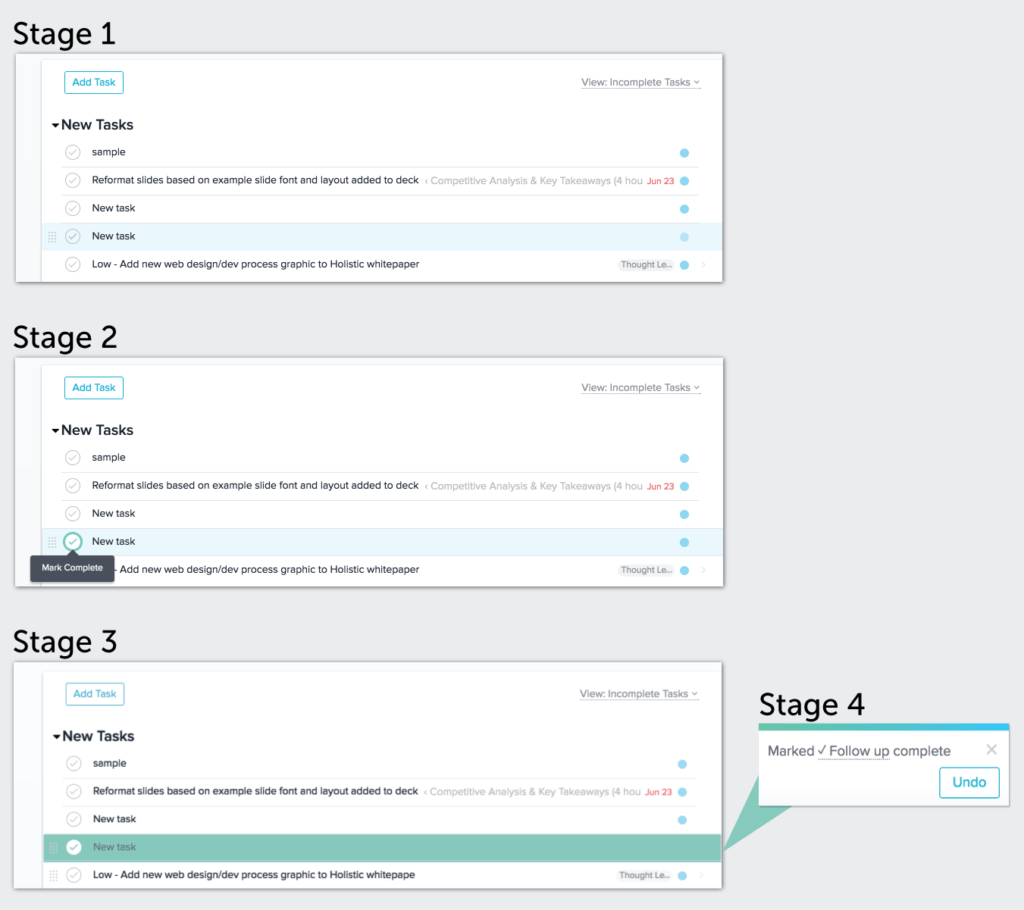
In an application as important as Asana – which helps teams track large project workflows by assigning and checking off tasks – system feedback is essential. Take this example of checking off a task:

Stage 1: The user sees the tasks that have been assigned to them. Overdue tasks are noted in red. All tasks that are in progress are labeled with their corresponding title.
Stage 2: The user hovers over the checkmark. Instead of the checkmark just changing color, the user is also given a modal notification – “Mark Complete” – which gives them feedback about what will happen if they click.
Stage 3: The user clicks the check mark. The screen flashes, the task is highlighted in teal green, and then the task disappears after a moment.
Stage 4: The user gets another modal notification in the bottom corner of his or her screen – “Mark [Task] Complete.” If the user needs to “undo” his or her action, they can simply click the Undo button, which will restore the task.
The sequence is so simple that it would be easy to take for granted. Despite the sequence’s simplicity, its importance is massive. Without these quick notifications, the user wouldn’t know what happened when they checked a task off. Worse yet, they wouldn’t know how to restore a task they’d inadvertently checked off.
Examples
System feedback – something that is as important today as it was in 1995 when Jakob Nielsen first coined the term “Visibility of System Status” – is an important piece of the usability puzzle.
There are many ways to communicate and confirm actions taken but some examples include:
- Subtle microinteractions accompanied by motion
- Modals with visuals and clear messaging
- Hover state messages
- Notification messages
- Progress steps – with the current step highlighted – to let users know what’s happening as they interact with your experience.
Takeaway
System feedback results in more patient customers who will be more likely to enjoy your experience in the end. Let the analogy of “two-way communication” be your guide to creating consistent system feedback that works.
Looking for more insights from UX guru Jakob Nielsen? Check out our podcast episode on The Future Of UX Design


