Article
UI/UX Principle #7: Use Wireframes, Mockups, and Prototypes Appropriately
The Gap from Good to Special
Ira Glass provides an interesting quote about the challenge inherent to storytelling:
“There’s a gap [ . . . ] for the first couple of years you make stuff, what you’re making isn’t so good. It’s trying to be good, it has the ambition to be good, but it’s not quite that good. But your taste, the thing that got you into the game, is still killer [ . . . ] We know our work doesn’t have this special thing that we want it to have.”
The meaning of the quote can be extrapolated to UI/UX design because creating experiences is a type of storytelling of its own, wherein the user is the protagonist and the design team members act as the authors. The experience is the substance of the story, and ensuring that the experience is positive will create a loyal following. The challenge lies in identifying the users’ needs and finding the “special thing” (a well-designed product) that allows them to accomplish their goals, thereby bridging the gap from something good to something special.
Ingredients for Making a Special Experience
Storytelling takes a very specific and refined skillset to get from the initial artistic vision to an authentic end product. In the case of writing, the progression is from sketching an outline to writing a rough draft to creating a polished final copy that the audience can interact with. In UI and UX design, the design progression of 1) wireframing, 2) creating mockups, and testing with a 3) finalized high-fidelity clickable prototype gives designers multiple opportunities to find the the right combination of elements to create something truly special.
It’s important to understand these distinct (but interrelated) 3 basic design methods so that your team can bridge the gap and uncover a game changing product.
1) Wireframes: The Planned Experience
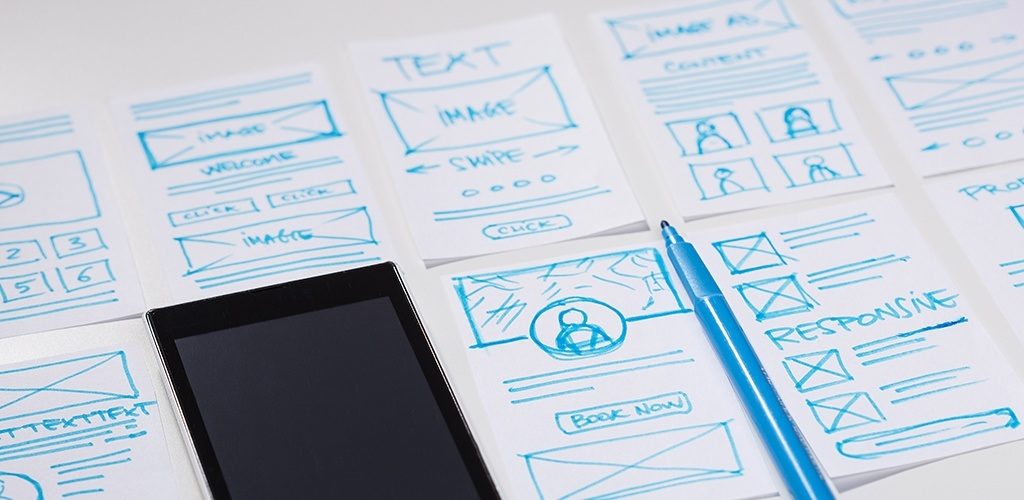
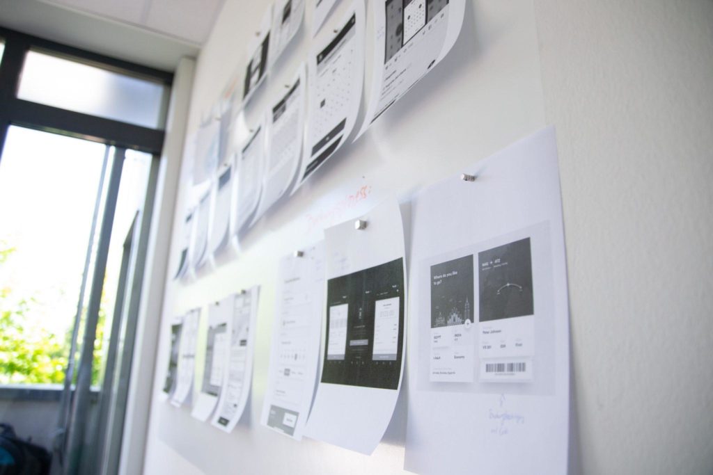
In writing, the author begins with a rough sketch of the story in the form of an outline. The parallel in UX is a wireframe. Here, the designer plans the layout, information architecture, user flows, and buttons/calls to action. Wireframes are low-fidelity blueprints that serve as the foundation for efficient iterations in the design, illustrating the different ways a user could consume information and interact with a product.
The process is analogous to creating an outline before you write – something basic that you can easily revise without feeling the pain of changing things already complete. Wireframing can become scientific by sticking to best practices and past analytics, but it doesn’t need to be a perfect process. It’s purpose is to establish a concrete vision for the end product layout, information architecture, and user flow…all before you start getting artistic.
Tools of the Trade: Pen & Paper, Illustrator, InDesign, Balsamiq, Omnigraffle, Axure RP, Sketch (and many others)
2) Mockups: The Branded Experience
Like a rough draft in writing, mockups are where the designer starts playing with language (in this case, visual language). Mockups allow designers to instill the brand, play with imagery, implement messaging, create graphics and layer in artistic elements & patterns to create something substantive – a high fidelity product closer to what the final design might look like.
Naturally, creating mockups is more time intensive. Due to the amount of care that is put into infusing life into the product, mockups make rapid iteration more challenging than wireframes. A huge benefit of mockups is that they concretize something conceptual that was developed during wireframing. This step follows wireframing because mockups are less focused on designing the roadmap for a product and more on creating a vision of what the real product could be.
Tools of the Trade: Photoshop, InDesign, Sketch
3) Prototypes: The Interactive Experience
Prototypes are the high fidelity mockups in clickable and satisfyingly interactive form. The designer can import the designs and create “hotspots” that allow clients to click through the product as if it were a live website or application. Prototypes are often presented to a client for acceptance or users for early user testing. In writing, this is your proposal – what you use to make your final pitch before development. Prototypes give the client something to interact with and a feeling for how certain user flows within the product work.
Tools of the Trade: High-fidelity screens imported into InVision; Marvel, Axure RP, Avocado
Don’t Skip Ahead
If you work in the design world, chances are you have really good taste. You likely have the skillset to turn your tastes into a design that looks amazing. But in UI/UX design, looks can be deceiving.
Skipping wireframes comes at the trade off of not locking down efficient layout, interactions, and information architecture because aesthetic mockups look deceivingly good. Skipping mockups comes at the expense of not thinking deeply about how to craft an experience that makes users take action, supposing a developer can simply figure out how to create those experiences using code. Skipping prototypes comes at the expense of jumping into the heavier code process without understanding whether the user flow works properly or if the calls to action are found naturally. By skipping any of these crucial steps, your team could miss out on the opportunity to create a truly special experience for your users.
The Business of Being World-Class
As the Nielsen Norman Group articulates, “Wireframes and prototypes are the most popular type of deliverable among UX professionals. They are used to communicate (and perform usability tests on) page layouts, information hierarchy, and, in the case of interactive prototypes, interactions.” There’s a good reason we start with lo-fi wireframes before proceeding to hi-fi mockups, and finally, to interactive prototypes. Fresh Consulting is in the business of providing world-class experiences to clients, and the aforementioned sequence is the most basic form of great UX design to get everyone on track in order to create impactful websites and applications.
Bridge the gap between a good idea and your authentically special end product by following this tried and true design methodology.


