Article
5 UX Design Tips for eCommerce

As the business world continues undergoing digital transformation, companies and organizations must continue thinking critically about how to better cater to their customers’ needs. One key consideration in the retail and professional services industries is eCommerce. Creating a balance between online and brick-and-mortar presences — that still maintains brand integrity — is essential.
In 2020, eCommerce sales accounted for 18% of all retail sales, not just in the United States but worldwide. This is expected to reach 21.8% in 2024. Bottom line, online shopping has huge implications for an organization’s health and longevity, and when you have e-tailers like Amazon to compete with, your business needs to not only coexist but also stand out.
(if you’re interested in learning more about The Future of Retail, you can find our podcast on the topic by following the previous link, and find more “The Future Of” episodes on Apple Podcasts, Google Podcasts, and Spotify)
User experience (UX) is vital to eCommerce because it enables customers to navigate your website or digital platform easily, find what they need, and make a purchase, among many other things. When your customers have a great experience, loyalty and trust are fostered, which often translates to repeat purchases.
Optimizing UX makes sense for immediate ROI and continued growth, period.
In this article, we’ll review the significance of UX design for your eCommerce store or platform, provide five tips for effective UX design, and explain why our approach to website design and development process provides our clients and partners with a competitive edge.

The Implications of UX Design for eCommerce
Prioritizing your customer experience strengthens your brand. Stronger brands build loyalty and trust in users. More loyalty and trust ultimately lead to more sales.
Let’s dive further into the user-focused factors that illustrate the significance of UX design for eCommerce:
- Increased customer loyalty and brand awareness: High-quality UX design will make your users feel comfortable and empowered. By evoking emotion — and even delight — you’ll develop a strong link between your current customers, prospective customers, and your brand.
- Increased conversions: Good UX translates to more reliable conversions, as stated previously. To pull this off with regard to eCommerce, your website or platform must effectively communicate the benefits that your products and services deliver, then lead to strategically placed CTAs (calls to action). A seamless user flow will encourage site visitors to complete the ultimate goal — purchasing products. But within the notion of ‘seamlessness’ are individual building blocks that increase a prospective buyer’s purchasing intent incrementally.
- Increased revenue: There is a direct link between eCommerce user experience and profit. Purchasing behavior and brand evangelization are more likely when users aren’t frustrated by confusing messaging, extra clicks, or disjointed navigation. A user bouncing from your site is a missed sale and, potentially, a compromised relationship.
- Decreased bounce rate: Building on the point above, dozens of elements are involved in keeping users on your site. Providing clear navigation options for your users and reducing onsite distractions correlates to a decreased likelihood that they’ll reach your site and ‘bounce’ before purchasing. Something as simple as a well-placed UI animation can capture interest and provide additional usability — at Fresh, we argue that motion is essential to UX, and that it isn’t just added flair.
- Turning potential customers into loyal customers: Creating the ideal customer journey ensures that customers will remain loyal to your brand and will return to your eCommerce website for more purchases. Depending on your goods, you might have one-off buyers, but for those who return, loyalty isn’t created by accident. It requires being strategic at every touchpoint.

5 Tips for an Effective eCommerce UX Design
Your eCommerce website design needs to mesh with your target users and their unique needs. A customized, tailored experience is recommended, as what works for Costco, Sephora, or any number of other eCommerce vendors won’t necessarily work for your users. That said, there are a few hallmarks of UX that are applicable across the board:
Capture Attention Immediately
eCommerce is competitive, so how can you get visitors to come to your site and stay there rather than spending money with your competitors? First impressions matter, and that’s where a well-designed homepage comes into play. Just as a for-sale home needs curb appeal to attract potential homeowners, your website needs an inviting homepage to attract potential customers.
While the homepage isn’t the sole entry point for your website, it’s essential to consider. Ideally, it will interweave the following aspects in a clear page architecture to encourage your visitors to engage and explore more. Here are a few things to consider during the design process:
- A balanced user interface that meets users’ needs (strategic information architecture)
- Clear and relevant UX writing that meets SEO best practices and communicates product details
- Clean and relevant images and design elements
- Simple navigation and functionality
- Compelling calls to action (CTAs)
- A user-friendly shopping cart and checkout process
Keep Navigation Simple to Create Intuitive User Flows
Complex websites confuse prospective customers and cause high bounce rates. Bear in mind that most users scan web pages to quickly find the information that’s relevant to them. This is why the key strategy for navigation is to break information down into easily scannable sections on the same page rather than giving each section its own page. The fewer pages you have on your website correlates to the fewer opportunities your users have to drop out of the purchasing flow.
Flat navigation, as opposed to deep navigation, can accommodate the different ways in which people locate and hone in on specific details, as well as decrease the number of pages on your site.
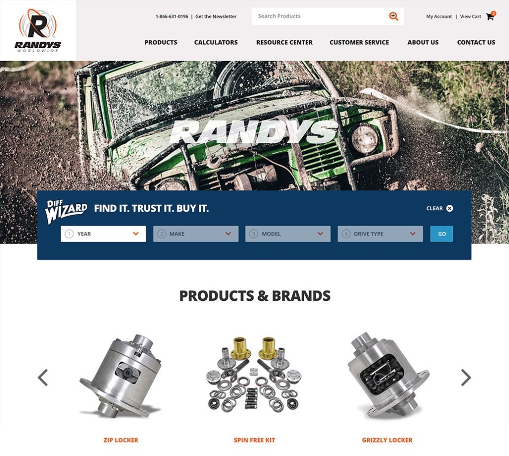
When we designed the website for RANDYS Worldwide — an eCommerce site with thousands of products — it was essential to keep it organized and usable. Providing an efficient way for users to access and easily navigate the product database was a key consideration, and our team met the challenge by utilizing a three-tiered filtration system that not only applies the brand’s unique visual identity to every customer touchpoint but also simplifies the search field.
The outcome is a tool for users to easily access product pages, locate their parts, and complete the purchase, which obviously has significant value for RANDYS as well.
Upgrade Your Brand and Customer Loyalty
To succeed in eCommerce, you need to create a unique brand that stands out among your competitors and showcase it across your various digital touchpoints. Many organizations have an established brand which is important, but there’s still a challenge of carrying brand integrity through the entirety of the experience.
If you’re not there yet regarding your brand — or if you need to rethink it — we provide services to address the challenge. The output can be something like we did for Epiq, in their unification with DTI. Analyzing hundreds of digital touchpoints, identifying themes and discrepancies, and communicating our insights, we created a DLS, or design language system, that allows Epiq’s team to apply the brand across their range of microsites and the dozens of apps in their technology suite.
Other elements of creating a brand that drives loyalty and customer retention include:
- Developing and implementing a clear UVP (unique value proposition)
- Creating an attractive visual showcase for your most popular products
- Designing a compelling look, feel, and tone and applying that through copy and visual elements
- Presenting your brand identity consistently across digital and non-digital touchpoints, connecting your online and offline channels
Leverage the Power of Visual Design
Visual imagery is vital in determining the perceived quality and memorability of your website’s customer-centric experience. A low-fidelity thumbnail can harm brand perception; a high-fidelity product shot or exciting video draws attention and interest. When users come to your page, you want them to have a positive reaction, and visuals play an essential role.
A major differentiator for Fresh is our end-to-end approach: strategy, design, development, and engineering of various types, working together as a whole. But underlying technological innovations like RPA (robotic process automation) and AI-powered chatbots, the bones of your website — and the visuals that bring it to life — are essential.
No matter how sophisticated your experience gets, tackling the basics (like simple visuals) is essential. Visual imagery can be incorporated in three primary ways, and each of them has its unique uses and effects on customer psychology:
- Static images: Photographs and creative images can be used to establish a mood or convey product information. Product images are also essential to enhance your product descriptions, but keep in mind the previous point about the visual fidelity of images being a key factor for brand perception.
- Video: Video can be used to demonstrate product use, provide tutorials, or introduce your customers to your team. From explainer videos to commercials and shorts, video is a media type that users are familiar with and expect as an option to consume content.
- Motion: Motion differs from video in that it is more fluid and non-linear. It is not only decorative but also engaging and interactive, and used strategically, it can guide customers throughout the purchasing flow.
You can make the most of visual imagery by combining these aspects in your customer touchpoints.
Update Your Experience Based on Insights
We already mentioned the importance of continual evolution to meet your customers’ needs. The way to ensure this process is ongoing is by updating your brand dynamics and other digital elements based on user research.
Your audience is your key to finding out what you need to include and when, so make sure you get their feedback and prioritize it. During the design process, usability testing is essential. After your site is launched, we recommend continuing to review data and analytics and making website adjustments as needed. Also consider:
- Interviews with customers to identify their needs and concerns and collecting data in a research system
- Share customer feedback with your design and development team
- Optimize the user experience iteratively and incrementally
- Ensure that what customers see in brick-and-mortar locations (if you have them) matches what they see digitally
- Minimize bounce rate and cart abandonment with re-designed CTAs, user flows, and site copy

Need help with UX design for eCommerce? We’d love to help.
As we hope is clear, high-quality UX web design is essential for successful eCommerce programs. Not only do our strategists, designers, and technologists understand best practices and the general technology landscape, but we also understand various subsets of the consumer and retail industry(s):
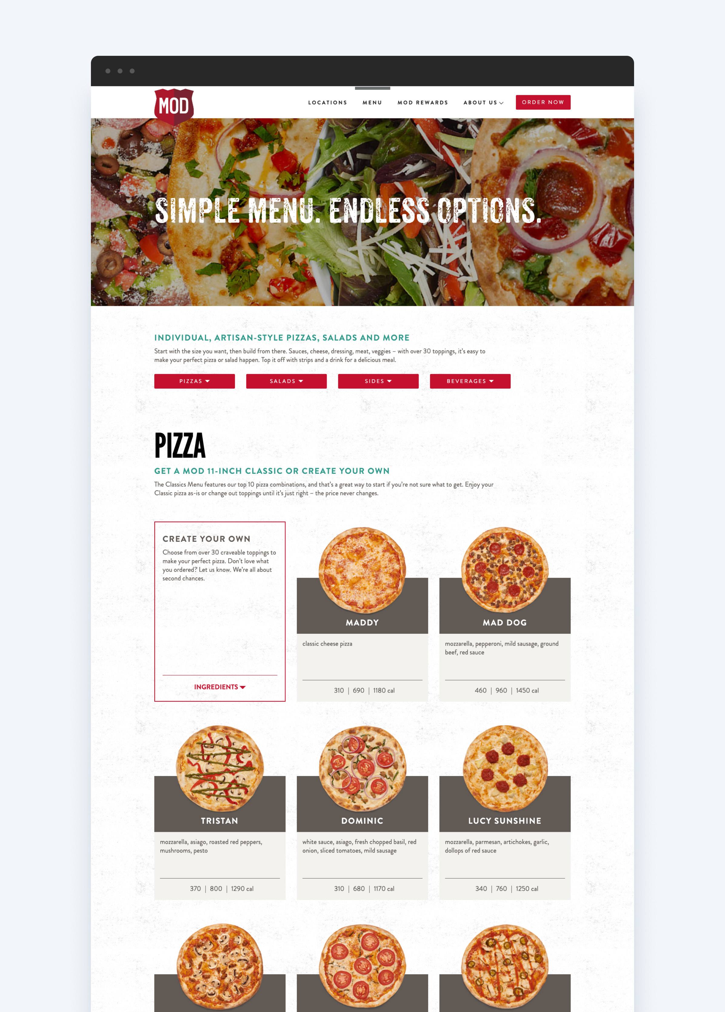
- Food and beverage with MOD Pizza
- Operations and logistics with Harbor Wholesale
- Consumer packaged goods with Continental Mills
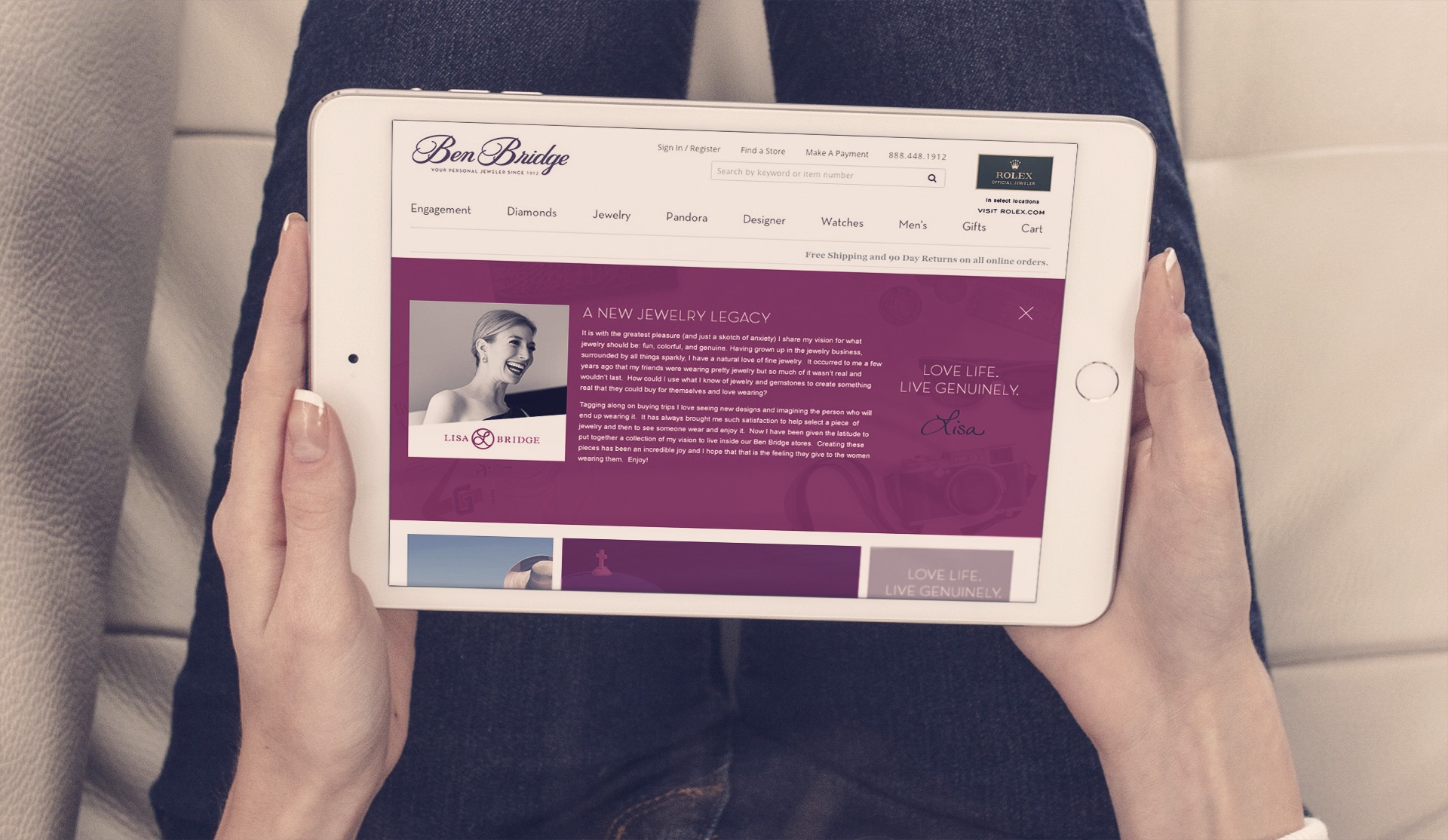
- Luxury jewelry with Ben Bridge
Whether or not your business fits into one of the above categories, your needs and your users are unique. That’s why we take a customized consultative approach to each project. We’d love to connect to learn more about what challenges you’re facing and how our team can help you realize success.
Contact us today to learn more about how we can combine our talents and address your eCommerce and web development needs!


