Article
A Roadmap for Website Design Across Industries
In 1991, there was one website: the World Wide Web. Thirty years later? 1.9 billion websites and counting. With even more innovative possibilities for the internet on the horizon with the advent of Web3, the number of websites — and the sophistication of website design — will continue growing exponentially.
But why should businesses care? The answer, if you aren’t convinced of the value of having a website already, is simple:
A website is the digital face of your brand, or as usability guru Jakob Nielsen calls it, ‘the most valuable real estate in the world.’
In order to strategically plan and develop your plot of land in the ever-expanding frontier of the internet, understanding the trajectory of the web, principles of web design, and nuances of websites within different industries is essential.
In this article, we’ll introduce:
- A brief history of the web (Web1, Web2, and Web3)
- Fresh’s customized approach to web design and development
- Resources that showcase our experience across industries
- Different considerations when designing an industry-specific website
Without further ado, let’s discuss the web!
Where the web started, and where it’s going
Web 1.0, introduced in the early 90s, was a hub of interconnected but static web pages. Due to a lack of interactivity — unlike the dynamic digital experiences users consume today — historians refer to Web 1.0 (Web1) as the ‘read-only’ web.
With Web1, a small segment of users could contribute content, unlike Web 2.0 (Web2) — the internet’s current iteration. Web2 (the early 2000s to present) has essentially become a platform for user-generated content on personal sites, blogs, and various social media platforms.
Who owns personal data and user-generated content is a key consideration, specifically with regard to social media. In exchange for partaking in a social media application’s services, users give social media companies a degree of ‘ownership’ over their personal data, which has significant implications for targeted advertising and other elements of the way our online experiences unfold.
The basics of social media copyright law are worth understanding. In an article titled “Who Owns Your Social Media Content?”, lawyer Adam Weissman writes:
“Simply put, you own the content you post to social media, but you’ve given each platform a license to use it as spelled out in their terms and conditions. These licenses are slightly different from each other, but all of them grant the social media platform the right to use your copyrighted work in whatever way they see fit.”
By granting a social media company permission to use your personal data and own a stake of your copyright work, anyone can sign up for an account on Facebook, Instagram, Snapchat, Reddit, TikTok, or dozens of other options. Minutes later, they can begin sharing content and engaging with content shared by others.
In the era of Web2, users can also create personal websites more easily than ever. Advances in web technology, showcased via WordPress or many other content management systems (CMS), makes creating a homepage for your business or blog highly accessible.
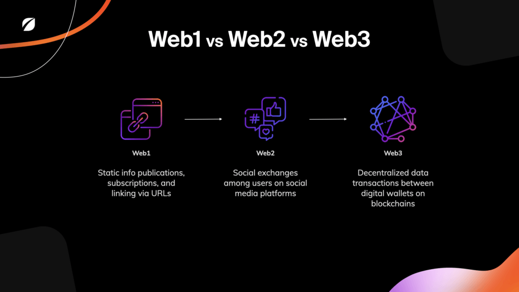
The internet’s next iteration, Web3, is on the horizon. Elisha Terada, Fresh’s Technical Innovation Director, provides a succinct summary of the differences between Web1, Web2, and Web3 that covers the basics and provides an overview of what we can expect.
The main takeaway regarding what makes Web3 different is decentralization; an ‘internet owned by the builders and users, orchestrated by tokens.’ (the previous quote is attributed to Packy McCormick, advisor to innovative venture capital firm a16z)
While this post isn’t intended to provide an exhaustive history of the internet, it’s important to understand its trajectory and the implications that has for businesses seeking to reach users and customers online.
- Web1. Once, the internet was a static, read-only platform with content curated by a small number of gatekeepers
- Web 2. Now, the internet is a launchpad for creating original content, capturing attention, and establishing differentiation on various technology platforms
- Web3. The internet’s next iteration is expected to not only be more immersive and dynamic, but also, something that is owned and operated by users — no gatekeepers, in theory.
Understanding the power of Web2 (and Web3) is essential because communicating your company’s unique value and maintaining market relevance are essential pieces to thriving in a high-competitive global economy.
Doing so online, where 63% of the world’s population spends their time, is crucial. And for companies across a range of industries, their primary digital touchpoint is a website.
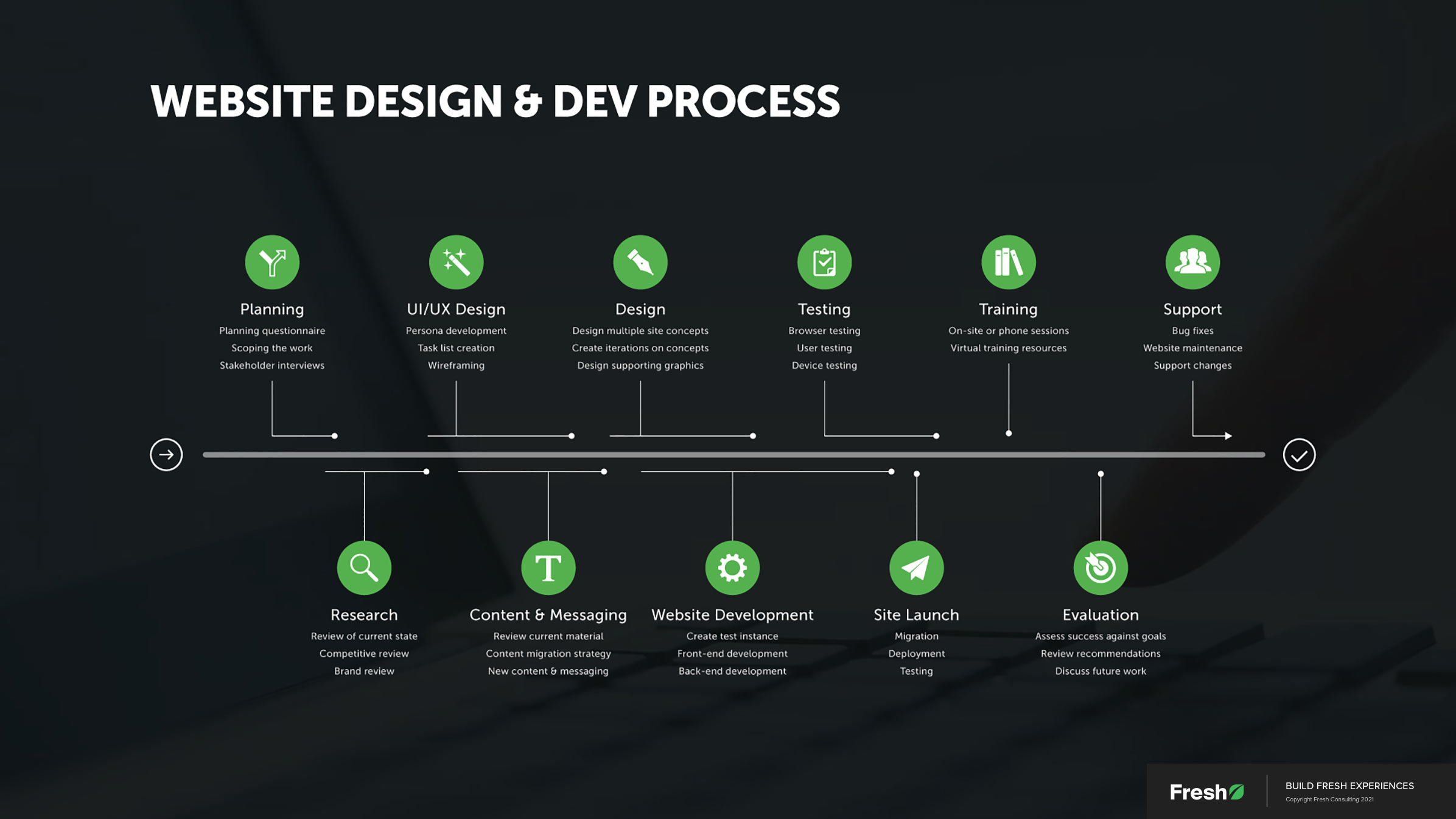
How we approach website design and development at Fresh
At a core level, our approach to web design is holistic. End-to-end strategy, design, and development are a few of our primary points of differentiation.
The strategy phase encompasses addressing business and user-facing considerations:
- User flow planning: How does the website funnel drive value internally, and how does it help users accomplish their goals on the site?
- Understanding analytics: What metrics are in place to evaluate success or failure? How can the data be used to pivot and adapt to user and business needs?
- Connection to other digital touchpoints: A website is just one channel — 94% of the world’s internet users, for example, use social media every month. How will your website tie to other campaigns, advertising, and marketing efforts?
The design phase is focused on creating an experience that’s aesthetically pleasing, logically organized, and tailored to an organization’s target users. Intentional design creates a powerful connection between website visitors and brands:
- Impactful messaging: Is content and messaging consistent with your brand and company story? Do your target users connect with it?
- High-end graphics, with meaning: Do included imagery and graphics fit your visual narrative and the story you’re trying to convey?
- Motion, video, and interactivity: Do these dynamic forms of media and tools for usability contribute to a more seamless experience that engages users and empowers them to accomplish their goals on your site?
The development phase involves not only creating the technology architecture that the website rests on, but also, the actual coding of the site using best-in-class tools:
- The tech stack: Front-end and back-end technologies are essential to consider; together they provide not only the foundation for your digital experience but also have an essential role in website optimization — site speed, maintainability, scalability, etc.
- Performance: Search engines value performance, as do users. Optimized code, plug-ins, and a content delivery network (CDN) lead to faster sites, a must-have for modern users.
- Integrations: Analytics, CRM add-ons, customer data acquisition, user feedback mechanisms, employee portals, and ticket management are just a few of the many integrations a website can have. Prioritization of integrations will change by industry.
- Back-end administration: Equipping clients to manage content is essential, as is the ability to make routine updates and site improvements that don’t need to be routed to a developer or an external vendor. At Fresh, we build all of our sites in such a way that the organizations they belong to are empowered to manage and scale the experience post hand-off.
Whether our team comes in at the beginning of a project when a brand is being developed or later in a company’s journey when a new website is all that’s needed, the holistic principles of strategy, design, and development mentioned above are essential.
How the design and development approach changes based on the industry
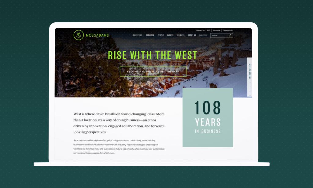
Moss Adams is an established leader in the world of FinTech (financial technology). MOD Pizza is an all-star in the food industry. Compass Lexecon is a premier global economic consultancy with a history of providing law firms, corporations, and government organizations with clear analysis and data-backed recommendations for approaching complex challenges.
Needless to say, web design and development look different for organizations as varied as the three mentioned above. MOD, for example, might place more of an emphasis on interactivity to draw users in, while seamlessly communicating the depth and breadth of their experience is a bigger emphasis for Compass Lexecon.
Our established process has been tweaked and refined over the course of 10+ years and hundreds of client projects, so we’re able to deliver the value that each client needs — it’s never one-size-fits-all. Customized solutions for different clients are possible while still approaching design and development in a principled way.
To provide a better illustration, in the following section you’ll find an overview of our website design and development work as it relates to different industries, accompanied by insights on what’s most essential when designing a website in a given segment.
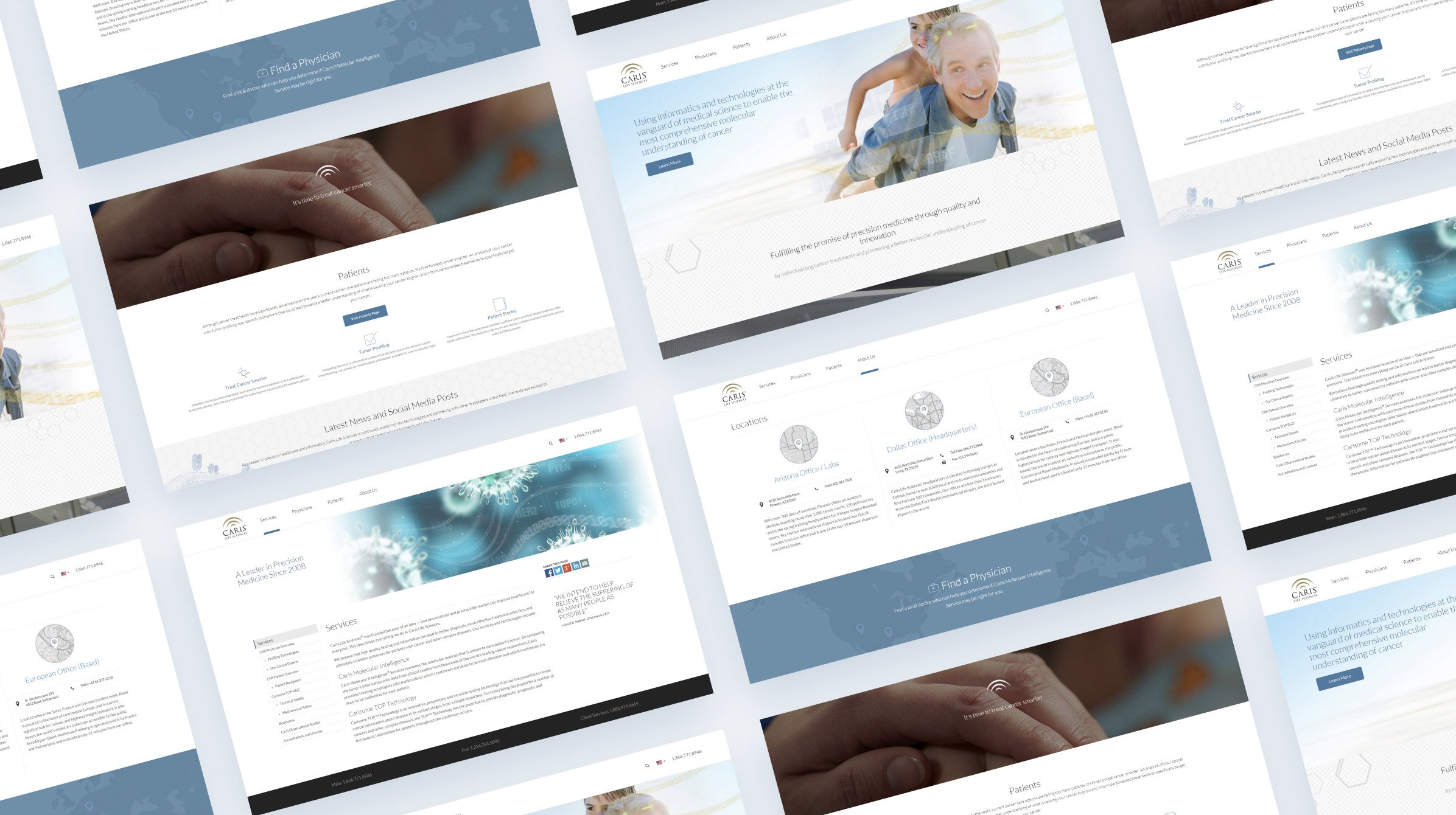
Website design for medical companies and health organizations
Patients who trust their providers get the help they need. Researchers who trust the integrity of information leverage it in their work. In medicine, healthcare, and other scientific fields, building a foundation of trust is essential. The same principle is of utmost importance when designing web experiences for organizations in the industry.
Our approach to website design and development always begins with some amount of strategic planning and user research. Within the medical industry, allocating resources toward this phase is even more essential. Spending time in the strategy and research phase equips organizations with the data they need to present their brand authentically and communicate a compelling message that generates a positive first impression.
The other phases of the website design and development process are also important — especially putting effort toward site security given the sensitive nature of medical records and Personal Identifiable Information (PII). But a robust, rigorous research effort on the front end creates a better understanding of an organization’s users, their needs, and how to create an immediate connection with them.
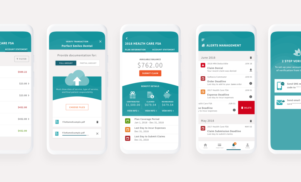
Below are four examples of our work with medical companies and health organizations across the spectrum. From a patient-facing website that makes information about cancer treatment more accessible to an internal academic portal that enables academics and scientists to conduct groundbreaking research, the principle of building trust manifests in each example:

Website design for FinTech
People feel comfortable sharing their assets with institutions that have a proven track record. Organizations feel at ease spending tens of thousands of dollars to enlist the services of financial companies and economic firms if the depth and breadth of their experience is clear.
When doing website work with organizations in FinTech, a primary focus is establishing a powerful brand and presenting a compelling company image. Building a structured, seamless, easy-to-navigate experience is just as important. Customers trust FinTech institutions to do the heavy lifting of complex asset management and consulting, and a company’s ability to competently provide those services needs to be communicated from the outset on its website.
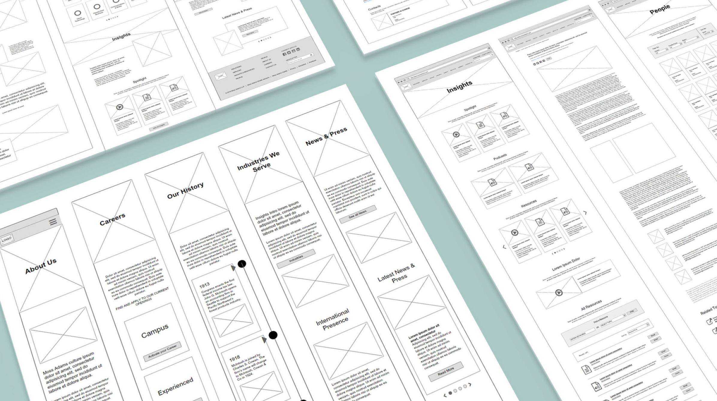
Information architecture — a website’s structural design, labeling, organization, navigation elements, etc. — is crucial to get right in FinTech. Effective FinTech websites empower users to find the information they need without stopping to wonder how the website works. Depending on the organization, an easily accessible library of resources and portfolio pieces that illustrate historical experience is worth creating, as is creating a search system that makes dozens of pages and thousands of data points easy to explore.
Holistic website design and development is crucial in FinTech as with any other industry, but “structure” is a logical place to allocate extra resources and effort. Below, you’ll find links to four case studies that illustrate what that looks like in practice:
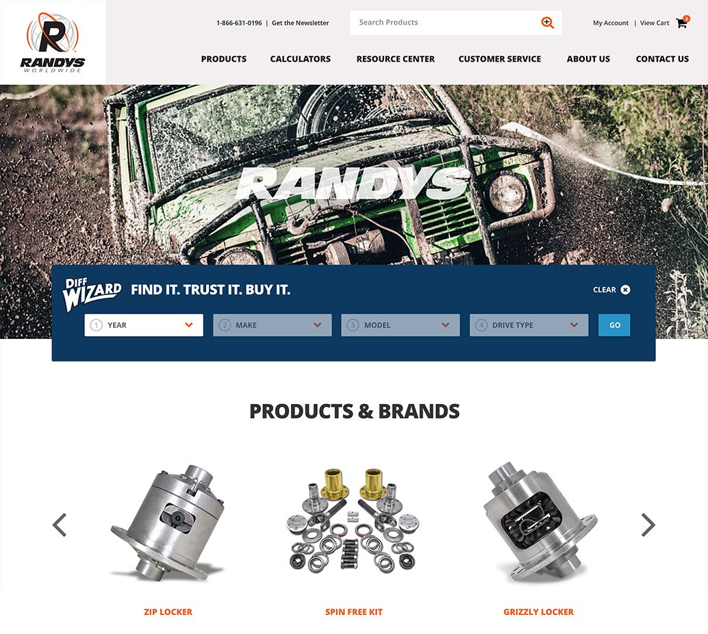
Website design for eCommerce & retail
Customers develop strong bonds with brick-and-mortar shops and stores they’re familiar with. Knowing in a split second what’s on aisle five makes shopping on a busy afternoon that much easier. Trusting in the quality of an organization’s goods — and its ability to provide exceptional customer service — creates brand affinity.
In a post titled ‘5 UX Design Tips for eCommerce,’ we elaborate on specifics for designing websites in this industry, including clearly displaying product information, prioritizing seamless navigation, and creating intuitive user flows. But on the whole, when you look at an eCommerce giant like Amazon (which also enables companies to create their own digital storefront using the platform), what stands out the most is usability and findability.
Customers shop online for the sake of convenience, and to deliver it, every element of an eCommerce experience needs to be seamless. From the number of clicks it takes to add an item to a cart to the way things are labeled and the ease of entering and storing payment information, every point of interaction on an eCommerce site should be free of frustration and unnecessary friction.
Below, you’ll find four examples of Fresh-created eCommerce websites that showcase the principles of usability and findability in action:
Website design for technology companies
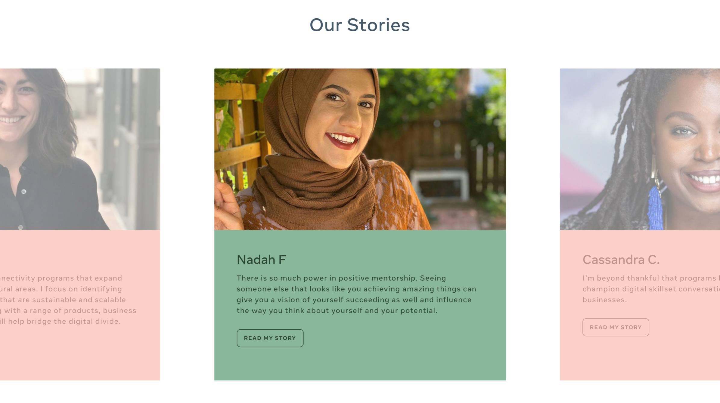
Sophistication and innovation, for technology companies, are essential sentiments to evoke for their site visitors. Communicating stale messages and stagnant approaches to providing products and services makes one’s business seem irrelevant, especially given the rapid pace of evolution in tech.
Dynamic media like video, interactive elements, and compelling content are essential to include on technology company websites. Not only do they provide a dynamic form of engagement and discovery, but they’re also easy to update, creating a novel experience for repeat site visitors.
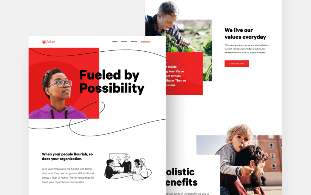
We’re also seeing a major shift toward technology companies communicating human-centeredness. This pertains not only to making products and experiences intuitive and usable, but also to communicating that human beings matter to the people doing the work and to the organization as a whole.
While the websites below ultimately highlight technology platforms and/or high-tech corporations, telling a human story — with real people as the central protagonists — was vital:
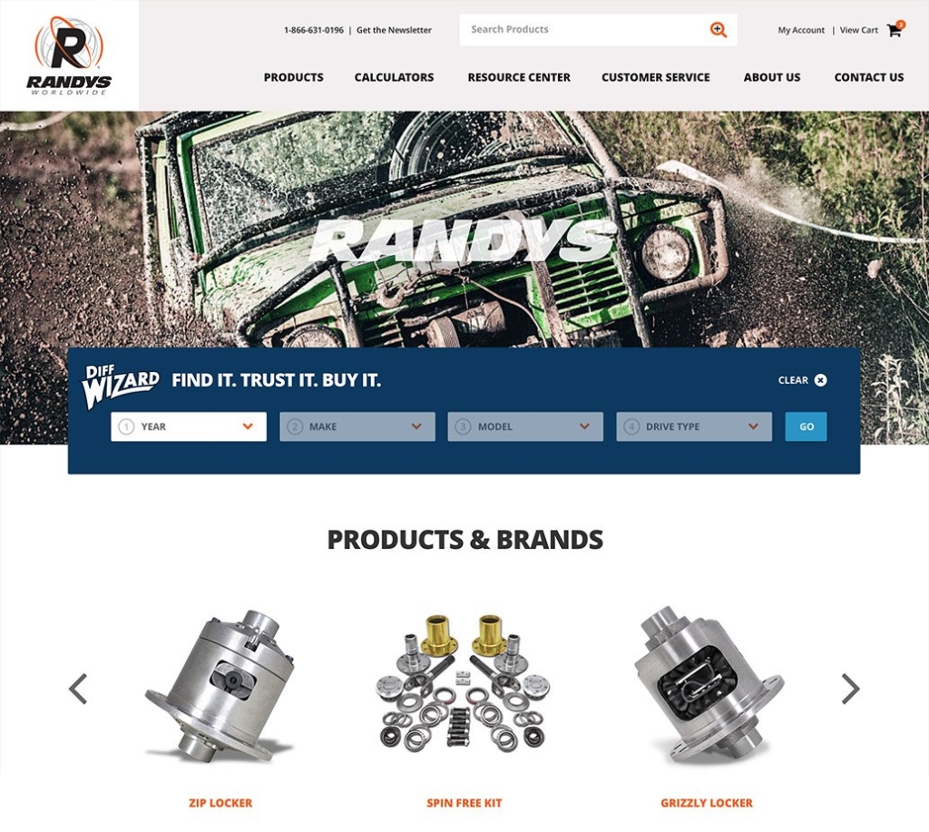
Website design for food & beverage and consumer packaged goods (CPG)
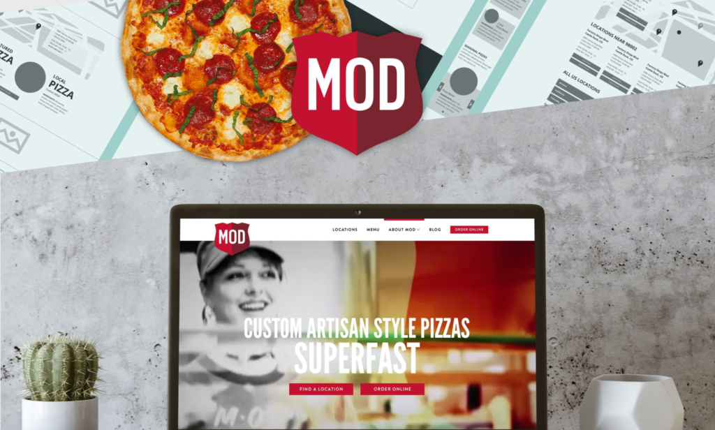
Social media platforms like Instagram, Pinterest, and TikTok have thrived because of the emphasis they place on visual content. When it comes to food, beverages, and consumer packaged goods (CPG), this is especially important. Words can’t sufficiently express the sensory qualities of food; an image or media asset does so in an instant.
The principle of ‘show, don’t tell,’ is most relevant here. A visual showing delicious pizza or a stack of pancakes evokes emotion, desire, and familiarity. For businesses within this segment, it also serves to drive users deeper within the site and closer to the vital stage of ‘purchasing intent.’ Written copy can be less of a priority here, even though intuitive labels and compelling headlines are important, as is keyword optimization for SEO.
In the food, beverage, and CPG industries, researching customers and providing strategically branded visual content is imperative, as illustrated in the examples below:
Website design for the recreation & tourism industry
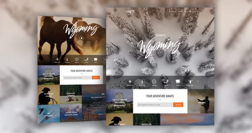
A website for a tourism or recreation company should set the stage for the in-person visit, from the ability for users to familiarize themselves with various attractions to tools for planning and information about exhibits. The goal is not to keep users on your site, but to drive them to action: buying tickets, planning their visit, contacting customer service if needed, and ultimately, showing up for the experience.
Information architecture comes into play here as well, but another important focus is the organization and format of written content. Information about features and attractions should be scannable. With concise copy and logical page organization, users can quickly scroll down a page to find what they’re looking for, rather than reading every word.
If you’re looking for tools to improve your process and output when writing for the web, we’ve written a post on the subject. To get a better sense of the principles we’ve mentioned in this section, consider exploring the websites we’ve created below for organizations in the industry:
Building a website? We’re here to help.
As we hope is clear in this post, there’s no one-size-fits-all approach to website design.
Following an established (but flexible) process allows you to stay on track and on budget, but the nature of various industries and the needs of individual organizations almost always necessitate a customized approach. There are universal principles of web design that are worth paying attention to, however, and they translate across most industries.
In any case, having a general understanding of what works and what doesn’t in web design gives organizations a leg up on the competition. Given that we’ve built hundreds of websites — and have a nuanced understanding of what’s coming next as we transition from Web2 to Web3 — our team is positioned to help organizations across the spectrum succeed in creating a memorable and effective online presence.
If you’re interested in learning more about our approach, let’s connect! We’d love to get more insight into your challenges and brainstorm how our team can help position your company for continued success.

