Article
UI/UX Principle #46: Text Box Width Should Help Users Read

In web design, one element is often forgotten: the width of your page’s text area.
Text boxes that are too large – which affects readability – could mean a higher bounce rate or content that gets missed. This has an effect on UX.
The key point is that the text box size should make your content easy to read.
Exactly what width is ideal varies with devices, layouts, and fonts. Authoritative sources such as Smashing Magazine and the Baymard Institute suggest line length 45 – 85 characters, but characters aren’t the only way to measure text box width.
Although views on line length and text box width differ, the bottom line is that the ideal text box width allows for optimal readability on your website.
On a large screen, text should not fill all the horizontal real estate
Fluid and responsive design factor into the layout of text areas. This is especially true when it comes to responsive design and how it impacts the vertical and horizontal real estate on your page. Text box width (controlled by an invisible or contained box limiting width) directly impacts the readability and usability of an experience.
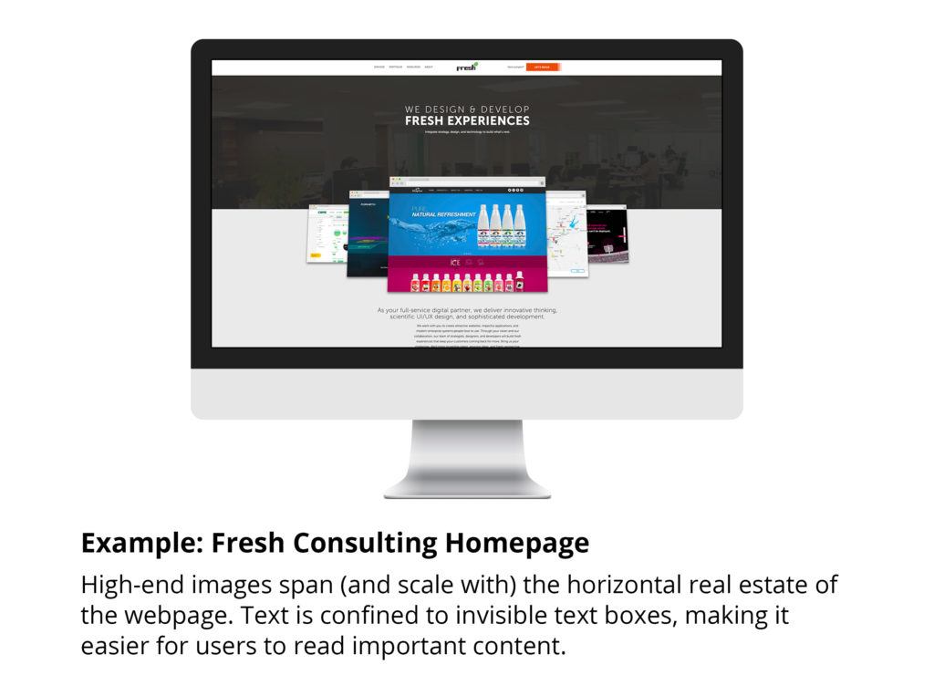
Your high-end images might respond to a variety of screen sizes and span across them entirely, but your text doesn’t have to – and it shouldn’t if usability is being kept at top of mind.
Experiences are being consumed on a variety of screen sizes and devices. As we get deeper into responsive design, we should design text boxes with the varying screen sizes of monitors and devices in mind. Text that spans across a large desktop monitor lacks readability.

700 pixels wide is a good benchmark for text boxes with substantive text
We often mistakenly expand text boxes to very large sizes. A text box as wide as a 30-inch screen is less efficient for reading and site design than one that is 700 pixels (2.33 inches) in width. No matter how wide you stretch your browser, the text box should max out somewhere near 700 pixels.
This isn’t different than measuring line length by number of characters – the target being between 45 – 75 characters per line. It’s just another unit of measurement. Ultimately, it’s a good way to set a concrete limit so that your text remains readable.
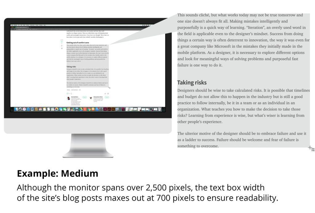
Medium – an online publishing platform with over 30 million site visitors per month – has blog posts with a width of 700 pixels maximum. If you shrink your browser, the text box width is 350 pixels minimum. Typically, blog text rarely spans past 700 pixels in length because of how users were trained to read books with shorter line lengths.
In the end, analyze for what’s most readable
In a thread on typography on StackExchange, one commenter provides a great rule of thumb – test the column width yourself:
“If you find yourself having to move your neck/head to read the text in a single column, then it’s probably too wide. Ideally, the reader should be able to scan each line just by moving their eyes. Of course, different media/devices are read at different distances, and different people may prefer different reading distances as well, so it’s not a precise science.”
In the end, analyze for what’s most readable, balancing these considerations with other important elements such as creating succinct copy, compelling content, and a scannable, scrollable layout.
Interested in reading more about writing content for the web? Check out these articles:
Creating succinct copy to focus attention


