Concordia
Xpress Touch
We set out to create a practical digital café experience
The Problem
The original Xpress Touch machine allowed users to customize their coffee beverage, but there were holes in the user flow. Truck drivers, students, and office workers all have varying familiarities with the world of custom coffee. Previously, the UI was solely icon-based, leaving users to guess what they were ordering. The design was dated, the UI was cluttered, and the user flow was disjointed.
Our Solution
We set out to elevate the experience of creating a custom coffee to be on par with doing so in a boutique café. From the cappuccino color palette to UI that made customizing coffee as seamless as pouring it from a carafe, every element of the machine was thoughtfully addressed and integrated.
Services & Capabilities
Bringing boutique coffee to more customers
The Xpress Touch is made to serve a wide variety of customers in various locations, from gas stations to college campuses and office buildings. With the wide variety of establishments and customers, it was just as essential to address someone’s experience ordering a black coffee as it was to address the needs of someone looking for a specialty drink.
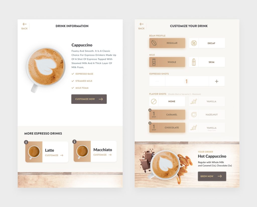
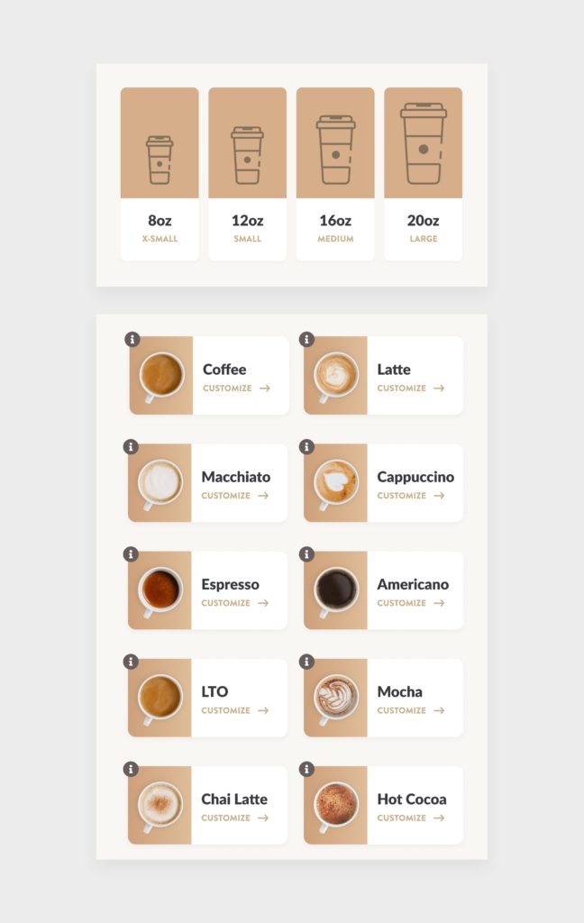
Previously, the UI was solely icon-based, leaving users to guess what they were ordering. Fresh designers used actual imagery from overhead photos of coffee beverages to provide the best ordering experience for all users.
Authentic visual styling
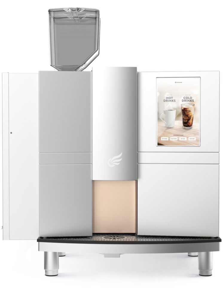
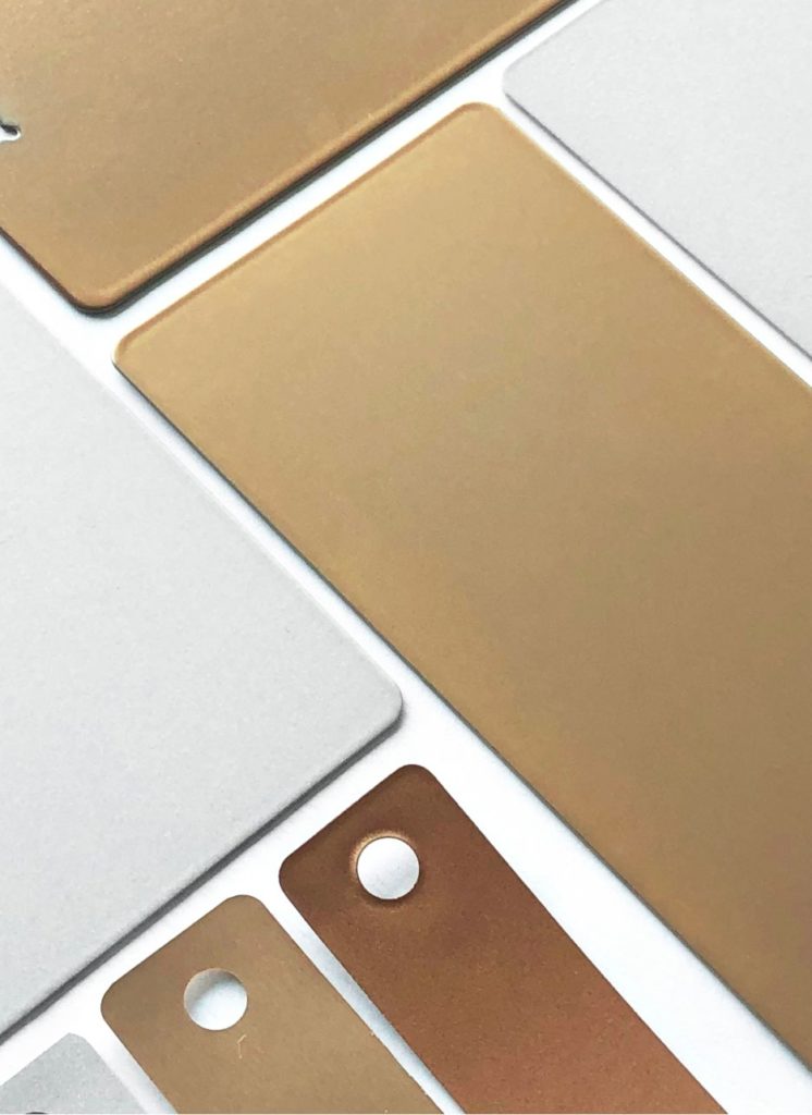
Fresh designers spent time in actual coffee shops observing customers, examining furnishing and product finishes, and documenting the common touch interfaces. The color, material, and finish of the new Xpress Touch were based on actual coffee hues identified in shops. The machine advertises high-quality ingredients and thoughtful preparation.
Communicating information with images
Whether or not a user is versed in the world of coffee, they can look at the pictures and see that a Macchiato is topped with milk, an Americano is similar to black coffee, and a Chai Latte is sprinkled with spice. With additional animation and motion, users see how the ingredients they select modify the drink and understand how each one changes the flavor.

Bringing the UI to life
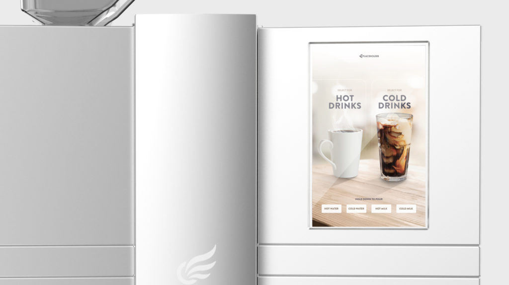
With blurred, bokeh effects and wood grain textures, we created the illusion of bulb lights strung above a coffee bar. While the Concordia machine isn’t intended for a cafe environment, our goal was to recreate that experience for users on the go.
Custom line icons communicate a barista’s attention to detail, and interactivity and motion lend to increased engagement and usability.
Seamless form and function
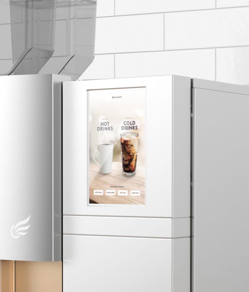
Machines have utility. In the case of Xpress Touch, it’s to provide coffee for users in various settings. But the equipment under the hood doesn’t accurately reflect Concordia’s user-friendly branding. Our redesign creates chemistry between different parts of the machine. A pewter casing reduces the machine’s visual mass. Gold undertones provide a visual highlight for where a user should place their cup. A subtle logo allows for seamless implementation in branded environments.
Visual elements should connect. The stylistic synthesis of Xpress Touch reimagines a machine as a holistic customer experience.
Before & After
Before
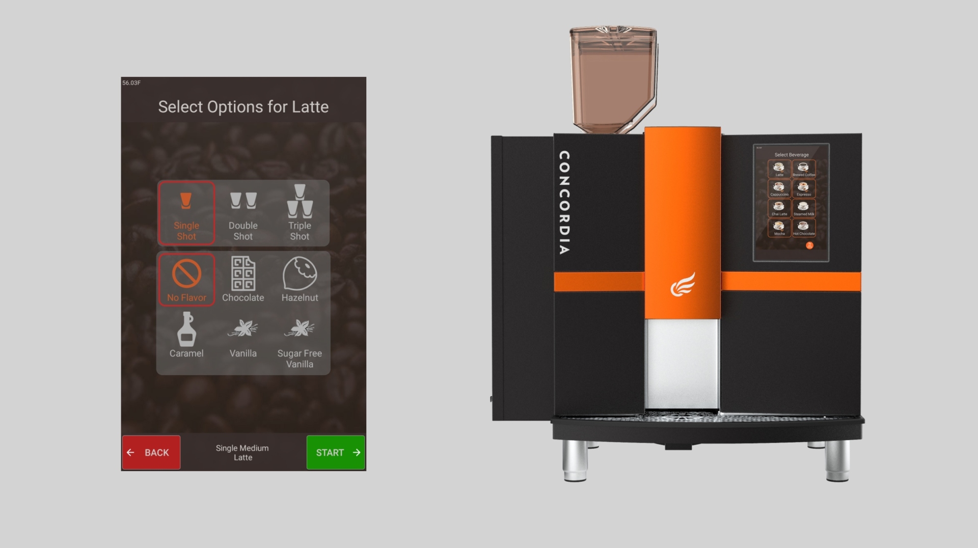
The old UI color has high contrast but lacks a connection to coffee. The color, material, and finish drew the user’s eye to the wrong places.
After
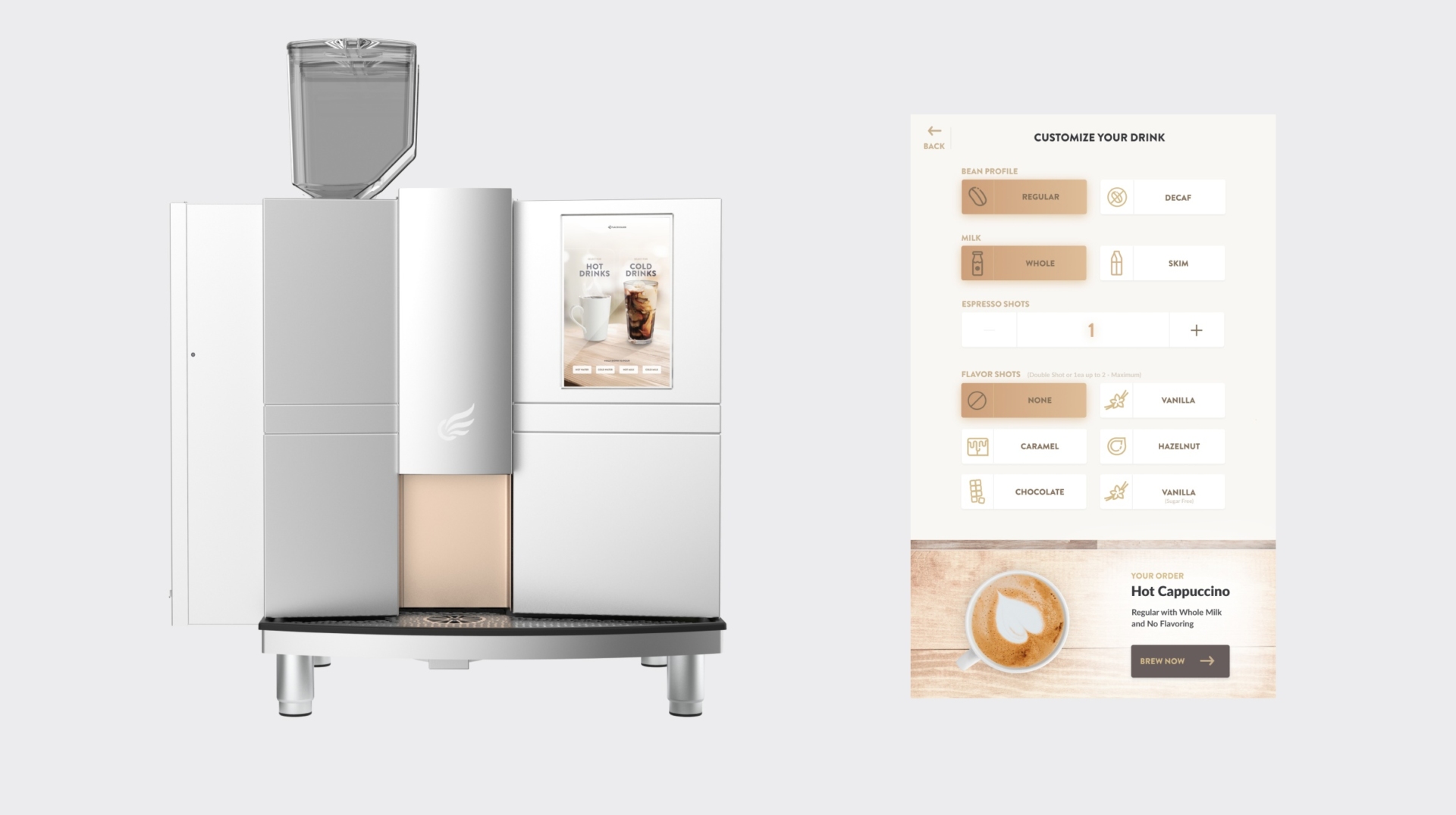
The UI was updated with a more intuitive flow and an updated look. The machine has been lightened to reduce its visual mass and simplified to highlight key interaction points.
